All 30 MLB Primary Logos: Ranked
Two weeks ago, I went to Cincinnati for the express purpose of seeing a game at Great American Ballpark, the latest chapter in my efforts to visit all 30 Major League stadiums. A big part of these trips is buying a piece of official team merchandise, The only teams for whom I won’t buy something when I got to visit their stadiums are the Braves, Phillies, and Marlins, all of whom are division rivals to my beloved Mets. something I’ve been obsessed with ever since I was a little kid.
Even before I fully understood the rules of most sports, I’d spend hours looking at their logos and uniforms. I was a sucker for most of the marketing gimmicks of the late 90s — I owned a Kerry Collins Carolina Panthers jersey and had Toronto Raptors and Mighty Ducks of Anaheim posters in my room despite rooting for none of those teams — and would get even more excited about the announcement of a logo or uniform change than I would about any big free agent signings, trades, or the games themselves. This fascination was fed by the yearly Star Struck catalogue, which featured every major and minor league baseball cap, as well as paraphernalia for not only the NHL, NFL, and NBA, but also the nascent MLS and nearly every major NCAA athletic program. I found it totally engrossing.
So, in honor of the great city of Cincinnati and my continued affinity for all things trademarked, I decided to rank every Major League Baseball primary logo from worst to best. Please note that I said primary logos, not cap logos. To the casual observer, the icon placed on the cap of a team’s home uniform may seem like a “primary” logo since it’s usually its most identifiable, but, in reality, teams have created much larger and more complicated designs to serve as their primary identifier. It’s an important distinction. Also important is that I’m using Chris Creamer’s Sportslogos.net as my source for determining what logos are current or retired. If this article peaks your interest in the graphic design of sports, I recommend checking out this website. It is the most comprehensive and well researched database you’ll find on the subject, as well as the source of endless hours of learning and entertainment for me.
Without further ado, let’s play ball:
30. Cleveland Indians
Discussing the Indians logo is always an awkward situation because it requires me to acknowledge the complicated legacy of the Chief Wahoo. The Native American caricature was instantly identifiable and iconic — when I brushed my teeth as a child, my parents would remind me to make my face look like the “Indians logo” to get maximum coverage — but it is, of course, unquestionably racist, especially when early iterations are taken into account. I think the whole debate surrounding Chief Wahoo and pretty much every other sports team named after Native Americans represents an interesting shift in the conversation about racism. It forces fans of those teams (who probably don’t intend to be discriminatory) to confront the offensiveness of the thing they love and acknowledge that, even if it isn’t meant to be hurtful, that doesn’t mean it isn’t or that it doesn’t enable more offensive content. Can you imagine what would happen if Sports Illustrated published this cover today?
Anyway, the Indians had an opportunity to explore a whole new brand identity once they retired Chief Wahoo from their official uniforms this year, but, instead, they adopted perhaps the most generic block “C” possible as their primary logo. I actually think this looks fine on their caps, but something like the cursive “I” or even their home uniform wordmark would be a more exciting primary mark.
29. Tampa Bay Rays
BORRRIINNNGGG.
The Rays’ identity has been in a bit of a crisis ever since they dropped “Devil” from their nickname in 2008 (say what you will about this gradient and this shade of green but at least they were memorable). They can’t seem to decide if their name refers to the beam of light or the cartilaginous fish. This logo leans into the former by adding a little splash of sunlight onto their pedestrian word mark, and the result is something that feels more appropriate for a bank or insurance company. Their prior logo was also boring, but at least it was clear that it belonged to a baseball team!
28. Miami Marlins
I don’t know why, but the inclusion of the baseball here really bothers me. With colors like “Midnight Black” and “Caliente Red,” the Marlins’ redesign seemingly wants to evoke the misty, neon-lit feel of Miami nightlife, but it’s kind of hard to do that when (1) you make white such an important part of the logo by the baseball and (2) your team plays many of its games under a retractable roof. It’s also just hard to make something dark and sexy out of a fish gasping to be put back into the water — the art deco era logos were garish, but at least they leaned into the inherent quirkiness of having a fish for a mascot. And don’t even get me started on these uniforms, which are so dark it makes the wordmark almost unreadable. Plus, they do nothing to dispel the notion that almost everything about Major League Baseball in Florida has been a disaster.
27. Philadelphia Phillies
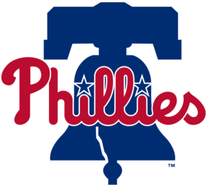
There’s something about the half-assed minimalism of the Liberty Bell here that feels so goddamn tacky, almost like it belongs on an early 2000s promotional cap where the graphic designer was asked to make an “extreme” version of the Philly landmark. It looked much nicer against a blue baseball diamond where the three core Phillies colors felt like they were complementing each other instead of fighting for attention like they do here.
26. Seattle Mariners
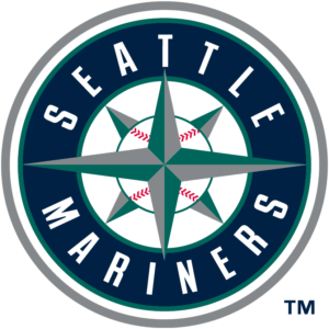
I’ve always kind of felt bad for the Mariners. They’re one of only two teams to never play in a World Series, which, combined with their geographic isolation from the rest of the league, has made them kind of an afterthought. Their irrelevance has only been compounded by their 18-year long playoff drought, which is currently the longest in all of the big four major North American professional sports leagues. But, as nice as I want to be to them, there’s no getting around the fact that their primary logo looks like something that belongs on the menu of a shitty seafood chain. At least they put together a nice uniform set.
25. Colorado Rockies
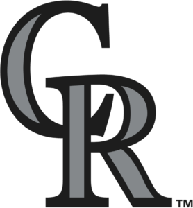
There’s nothing inherently wrong with this logo, but it gets ranked so low because it inexplicably replaced a vastly superior mark that featured the Rockies in all of their Purple Mountains Majesty. It was also one of the earliest dominoes to fall in the trend that saw teams abandon bigger primary logos for their cap logos for no apparent reason. People watch Rockies games so they can see players slug baseballs a mile high into that thin mountain air, and their old logo evoked that perfectly.
24. Milwaukee Brewers
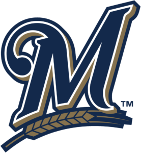
Another cap-as-primary rebrand. There’s something inherently inviting about a capital M, the loop on its left gives it a little action, and the underlining wheat ties it all back to the team nickname. But I can’t stop thinking about its similarities to the Twins cap logo from the 90s, and it’s just not memorable enough to be a primary logo. You don’t even have to go back to blue and gold — just give me the “M” and “B” glove with the current colors, and I’ll be satisfied.
23. San Diego Padres
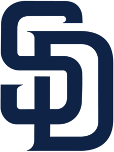
The San Diego Padres burst onto the scene with the most 70s uniforms and color set imaginable and have tried to suppress the memories of their cocaine and disco days since the mid-90s by getting more and more conservative with each redesign eventually settling on the same blue and white combination favored by what feels like half the league. I have this above the Rockies and Brewers because the interlocking SD is a classic, but I will admit that this design is just objectively bad.
Why does the part of the S that overlaps the D also cut it off? Why keep that white border around the S especially considering that the S isn’t cut off by the overlapping part of the D? It looks like someone forgot to make the background on the S transparent before they photoshopped the two of these together, which should not be the case since this was made by a graphic designer with the freedom to make shit up without copying anything from Google Images.
Anyway, the solution to all of the Padres design woes is staring them right in the face. Bring back the swinging friar, preferably in brown and yellow but the blue looks good too. Everything else you’ve done looks too generic or like the logo for an oceanside country club — the friar, with his goofy expression and full bodied swing, looks like the patron saint of fun. You’re a team that used to be defined by boring players like Chase Headley — now you have fun and swaggy players like Manny Machado, Fernando Tatis Jr., and Chris Paddack. Lean into that.
22. Pittsburgh Pirates
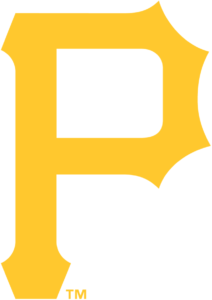
Again, another team that opted to “simplify” their primary logo without making the extra effort to make it anything but boring. The Pirates get placed ahead of the Rockies, Brewers, and Padres, though, since 70-plus years of history has lent this logo “iconic” status, and their attempts at incorporating an actual pirate into their design have either ended up too plain, too goofy, or too pale (Is that what scurvy makes you look like? And where did all of that red come from?). This logo would probably end up much higher if they found a way to contrast the gold with a black background, like it does on their classic cap.
21. Washington Nationals
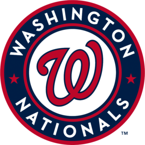
As you’ll read, this almost has the opposite problem of the Rangers logo — I want some more red to really lean into the Nationals’ identity and capture the vibrant, exciting feeling of attending a Nats game in person. As it stands, this logo is too subdued. Maybe some stars and stripes would help it connect with its city, too. This will be the first in a line of roundels.
20. Texas Rangers
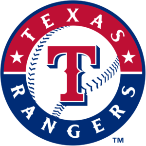
I feel like the Rangers have been struggling with whether they want to be a predominantly red team or predominantly blue team in recent years, and this logo brings that to light. Considering their primary caps are blue, it doesn’t make a whole lot of sense that two-thirds of this logo is red. Maybe keep the red T and make the circle blue? Or maybe bring make the baseball wearing a cowboy hat, what do I know?
19. Minnesota Twins
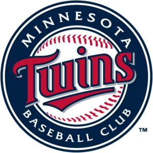
Plain but authoritative. The Twins aren’t a baseball “team,” they’re a “club”– a word that lends a sense of sophistication while hinting at some jocularity. Their pre-1987 logos are probably too literal for modern tastes, but I’ll always love them — the “M” and “STP” on the twins’ jerseys (named Minny and Paul after their respective cities) are great little details that hint at what make the Minnesota sports teams so unique.
18. Houston Astros
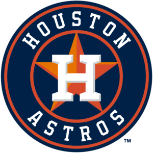
This logo is a welcome return to the Astros’ roots after a decade of trying to make the whole outer space/Old West thing happen, They abandoned that look only two years after Cowboys & Aliens tanked at the box office. Coincidence? I THINK NOT! but there’s something a little too conservative about all of that navy, especially considering all of the loopy shit they tried to pull off in the past. But if it’s all in the service of their great uniform set. I’m satisfied.
17. Los Angeles Angels
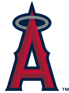
I love this logo on a conceptual level. The A stands for the team’s (now controversially unidentified) home city of Anaheim, as well as their nickname, and the halo on top adds a simple, playful spin while also doubling down on the Angels mascot. The dark outline and “3D” shadows within the A wash it out a little though. If they accented it with some gold like they did on their 50th anniversary caps, the A could really pop.
16. Cincinnati Reds
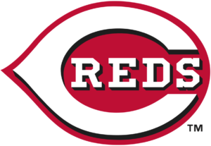
As with the Angels, I love the concept of this logo. It’s basically a sneaky way of abbreviating the teams full name without coming off as too wordy or ornate. That black drop shadow is absolutely killing me though, and dredging up memories of a lot of terrible design decisions from the 2000s. There’s nothing wrong with plain red!
15. Atlanta Braves
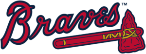
I know I ripped on the Rays earlier for using their uniform wordmark as their primary logo, but it works for the Braves. The script itself has a real vintage feel, and the straight, ready-for-battle tomahawk contrasts well with slightly more debonair font. Is their whole brand identity problematic as hell? Absolutely, but they were one of the first pro teams to react to public outcry over their more egregious iconography, and, in a world where the Redskins are still called the Redskins, this seems to have bought them some cover.
14. Arizona Diamondbacks
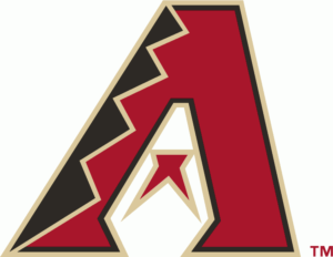
One of the few cap logo primaries I really like, this Diamondbacks logo captures the hometown and nickname of the team perfectly. Featuring a desert-y brick red and sandy gold outline, it’s quirky in all the right ways– from the snake scale pattern on the left side of the A to the snake tongue in the middle. They’ve occasionally gone overboard, but the Diamondbacks have made the most of a unique identity in ways that the Rays simply haven’t. Doesn’t crack the top ten because it isn’t the D-shaped snake.
13. Oakland Athletics
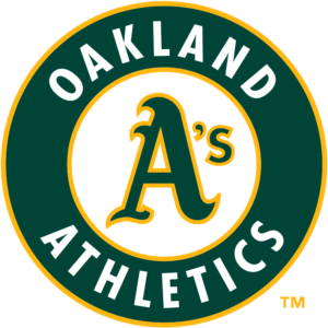
The A’s get obvious points for having a legendary identity that hasn’t changed over the years and a wholly unique color scheme of green and yellow. However, this is a team that’s had players like Reggie Jackson, Catfish Hunter, Rollie Fingers, Mark McGwire, Jose Canseco, and Ricky freaking Henderson, some of the flashiest and most colorful personalities in baseball history, and this logo feels little conservative by comparison. It could probably use some more of that audacious yellow or a shades wearing elephant or two. Love that “A” though, it’s such a cheeky bastard. Always lookin’ like it’s up to something with that sneaky little “S” by its side.
12. Boston Red Sox
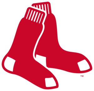
It’s two red socks. Get it? I know I praised the old school Twins logo for being literal, but this one is simplistic to the point of ridiculous. And yet, there’s something very classic and almost genteel about the way the two socks are allowed to hang there, unvarnished by any text or a roundel. It takes a storied team with a notoriously obnoxious fan base to turn an oft-overlooked garment into a symbol of baseball success, and that’s exactly what you get here. A sense of tradition that’d seem crazy anywhere else.
11. Kansas City Royals
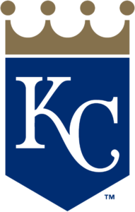
I really, really love the feel of this logo. It doesn’t feel too modern or too outdated, and the sharp angels of the shield and crown make it look like something that could appear in a Saul Bass titles sequence, or the opening credits from Casino Royale. My only knock on it is that, without the Royals script, it feels a little naked.
10. New York Yankees
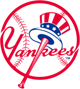
The outline and script could probably stand to be modernized a bit, but this is an all around solid logo that conveys what a “Yankee” is while also seeming warm and inviting. Thing is, the red is also completely incongruous with the Yankees uniform and their entire brand identity. They may be the most successful franchise in North American professional sports, but the Yankees’ dirty little secret is that their branding is boring as hell. They never miss a moment to remind you of how “hallowed” they are and how deep their history runs, and every piece of content and merchandise they produce is a monument to their own self-importance — if it were up to them, Babe Ruth would replace Andrew Jackson on the twenty dollar bill. Granted, you probably don’t need to try as hard in the logo department when you’ve won 27 World Series titles, but still.
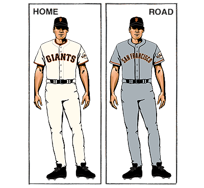
9. San Francisco Giants
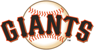
Eye grabbing, imposing, and ostentatious, this Giants logo is much more interesting than it has any right to be. It’s not just their wordmark over a baseball, it’s their word mark over a GIANT baseball with an orange tint. The orange tint is key, because it keeps the baseball from looking out of place the way it does in the Marlins logo, and certainly better than it did in the Giants’ old logo. It also ties it with their classic uniform set, and brings to mind both the controversial heyday of Barry Bonds and the Giants dynasty of now celebrated figures like Buster Posey and Madison Bumgarner.
8. Chicago White Sox
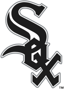
Never before has a full word been so artfully transformed. When I was a kid, it took me a while to realize that this was a diagonal, interlocking “SOX,” and sometimes it still doesn’t look like that to me at all; looking instead like some weird figure from a surrealist painting. But the real genius is that it literally spells out who the team is, without going down the boring script route like the Rays, and its makes use of a simple cap logo, but not one that’s too simple like the Indians’. Versatile stuff.
7. Detroit Tigers
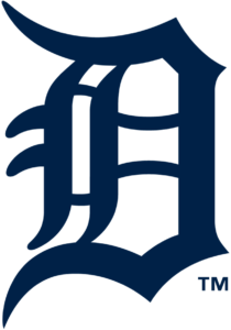
Few single-letter logos come more iconic or needlessly elaborate than the big Detroit D. It may seem a little too simple, but I ranked it so high because (1) no, this is not simple, this is a patently absurd way to write a “D,” and I love it, and (2) it’s become synonymous with the city itself. A similar design would be adopted by the old Detroit Cougars hockey team, and whenever people refer to “The Big D,” it’s hard not to imagine that D coming with all kinds of extra loops and lines. Heck, Tim Robinson and Sam Richardson win a big golden version of the logo at the D Awards in Detroiters, their cinematic love letter to the Motor City. Is that enough civic pride for you?
6. Toronto Blue Jays
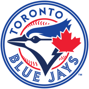
There’s a lot going on in this logo, but it isn’t overwhelming. It nicely balances the Blue Jays’ two key colors — blue for the jay, red for Canada — without feeling as bisected as the Texas logo. It also manages to layer a blue jay on a baseball on a border without feeling too busy. Straightforward and to the point, but not overly simplistic or empty feeling like some of the other roundels around the league.
5. St. Louis Cardinals

Like a lot of non-Cardinals fans, I’ve kind of grown to loathe the Redbirds and their whole “best fans in baseball” schtick, as well as the media’s fawning over what a “classy” and “model” organization they are. With that being said, things don’t get much more “classy” and “model” than their primary logo. The cardinal perched on a bat gives it a hint of playfulness, as does the “C” draped across the bat, but the bird is all business, and the sport, mascot, and team are all represented equally and deftly.
4. Chicago Cubs
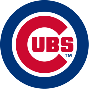
If you’ve been to Wrigley Field, you know that attending a Cubs game is an event, and, with the former Lovable Losers ascending to the top flight of the National League, that event has become more fashionable than ever. In a game that values tradition, the Cubs logo stands out by being both old (it was introduced in 1979) and distinctly modern. Reminiscent of the mod roundel, this logo is closer to pop art than the hallowed gothic scripts of yore, making it the perfect icon for an organization that can sometimes feel like as much of a lifestyle brand as a baseball team. And, like the White Sox logo, it’s another clever way of packaging a full team name that doesn’t feel bored.
3. Los Angeles Dodgers
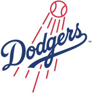
Snobby baseball fans like myself love to go on and on about how much we love a good pitcher’s duel or an exciting play at the plate, but baseball’s big moneymaker has always been the home run. Even if you had never heard of baseball before, I’d wager that the prospect of seeing an object get hurtled 450 feet through the air at 100 MPH would spark enough interest to convince you to buy a ticket. This logo tries to stoke that interest through non-verbal means, showing the inherently appealing image of a ball being hit really, really hard, and then, by draping the script below the speed lines, promises that the Dodgers, not some other team, will be the one to provide such entertainment. Iconography and marketing all wrapped into one.
2. Baltimore Orioles
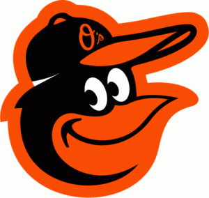
Even though baseball takes itself very seriously, there’s always been this notion that it’s a game first, and a sport second. And games, more than anything, are supposed to be fun, which is exactly what this anthropomorphized Oriole head hints at. It manages to be a little goofy and a little friendly, despite the fact that it was worn by hard-nosed players like Frank Robinson and Jim Palmer.
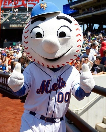
1. New York Mets
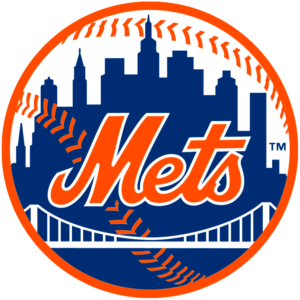
The line between art and entertainment has always been blurred, and determining where one ends and the other begins has been a source of debate and discussion since the first buffaloes were painted at Lascaux. Even more tense is the line between sports and entertainment.
For some, sports is the peaceful equivalent of war, a contest of human strength and moral fortitude that pits one population against another in the quest for eternal glory. But franchises and leagues are in the business of selling tickets, which means marketing themselves ceaselessly, finding new angles, and casting themselves as charming and exciting. As serious and no-nonsense as they may want to seem, they still have to attract a crowd. They need to promise something more than efficiency and technical skill. They also need something with a little pizazz. Something amazin’.
That sense of wonder, excitement, and fun is what I’ve always felt captured in the Mets’ logo. My life as a Mets fan has been plagued by heartbreak and incompetence, but this brilliant orange and blue baseball radiates with all of the optimism of the mid-20th Century America it was born into. Featuring the skyline of the most glamorous and bustling city of the world, it promises a game woven into the fabric of its community, something respectful and traditional but always with one eye on the modern world. The wordmark here, slanted to the right, is practically beckoning you through the front gates of Citi Field where a grinning baseball headed humanoid will greet you with a hearty hello. It’s a logo built around communicating a sense of pure sporting glee, and it’s almost impossible to look at and not hear that famous song playing in the background. “Meet the Mets/Meet the Mets/Step right up and greet the Mets…”