
The R-Score: A Metric for Evaluating Restaurants
Baseball stars, politicians, cars, and even credit cards are associated with sophisticated mechanisms for grading and scoring that weigh the various components of their actions and abilities as well as their costs and benefits. These metrics offer an easy way to assess and compare the objects of their focus to other units. In anticipation of an upcoming column here on The Postrider, I believe it’s time to bring a scoring metric to restaurants, and – after failing to find one subjective enough to capture a wide range of options and personal tastes but objective enough that its methods could be standardized and generally applicable to a diverse array of locations and users – I decided to invent one myself. I’ve named it the Restaurant Score (or, if you’re looking for something that sounds cooler, the R-Score), a metric on the restaurant experience between worst (0) and best (10).There is some possibility of run-over in the negatives and scores above 10 in extreme situations, but I’ll discuss this later.
The R-Score is a numerical restaurant measure I’ve designed that could apply to any sit-down dining experience, adjusting for expectations, quality, service, and even wait time. It’s made up of five key metrics made up of six pieces of data from each visit:
- Fare (value over price): This is the quality of the food and drink relative to the price (excluding tax/tip). If it was perfectly worthwhile, it will come out to a 1. If you do not feel the price of the food and drink captures it’s value, it’d come out to be less than 1. And if you feel like you just ate the greatest burger you’ve ever had relative to the price, it’d come out to be greater than a 1.
I decided to use value over price in lieu of a simple numerical rating for Fare because it captures expectations more accurately and is able to give due credit to, say, a situation like going to McDonald’s and ordering a $2 burger. The price may be worth the value, but it would be unfair to pit that burger up against one from an upscale steakhouse, as there’s a difference of both price and expectation of food quality. Hence, a simple 1-5 scale would not make sense. This equation is also a good way to track price at a restaurant over time, which is absent from our other metrics.In the future, this could probably use an adjustment for inflation… but I’m not trying to kill you all with my methodology here, so I held off.
The complicated part is determining the numerator: value. There are a couple ways to get value as close to an objective number as possible, even though it will always, by the very nature of how we individually relate to food, be a bit subjective. The best option is to use a comparative metric given either a near-identical food at a different restaurant or a comparative food at the same restaurant. For example, if a restaurant offers a burger for $10 and a pizza for $14, you can draw the comparative curve for this, given that, at $10, you chose the burger over the $14 pizza (Point A):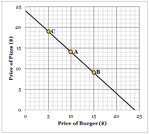
That curve reflects the trade-off of what you would have chosen if you had the option. For example, if you valued the burger at $15 ($5 more than you paid, but that’s irrelevant to the numerator), you wouldn’t have opted to switch to the pizza if it were priced at only $9 (Point B). Inversely, if the burger so bad you valued it at only $5, you would really switch to the pizza, even if it was priced at $19. Although a somewhat convoluted way of ascertaining your perceived value, it’s useful because it tends to center things around being exactly what you’d expect for the price and doesn’t let you go to the extremes (ascribing a zero value or claiming you got the greatest deal in history) without something going seriously wrong or right. This is also the most subjective field, so this attempts to both reduce subjectivity to the greatest degree possible and provide the most flexibility in scoring.Fare is weighted by 4 out of 10. - Service (1-5): Fairly straightforward, this is the quality of the service. Waiting a long time for food, drink, the bill, etc. would bring this down, but attentiveness, surprise bread for the table, and so forth would bring this up.
Service is rated by 4 out of 10. - Atmosphere (1-3): In recognition that this is often outside of the restaurant’s control, this component is weighted less. Atmosphere is the general vibe of the space and the pleasantness of occupying it. Things that might bring this down include a disgusting bathroom, being seated at a table where the kitchen door keeps hitting you, birds landing on your food outside, “I Gotta Feeling” playing on loop over the speaker system, or if some drunk belligerent walked up to you and punched you in the face. Things that bring this up would include great decor, some tasteful music choices, having a great table, or a clean restaurant bathroom.
Atmosphere is weighted by 2 out of 10. - Time-to-Seat (TTS) (in minutes): I spent hours thinking and running tests with this one because waiting for a table is not necessarily a good reflection of a restaurant’s speed of service but it can nonetheless decrease the overall enjoyment of the dining experience. Even if the food was perfect, the service was great, and the atmosphere was all-around divine, waiting 30 minutes for that table would make you a little peeved (or at least a little more than if you hadn’t, which is really what TTS captures). So I decided to make it a subtraction from the total score over a standard time of 10 minutes. This means that a 10-minute wait is roughly equal to losing out on one point of quality in another area.
- Above and Beyond (AAB) (binary): As opposed to TTS, AAB can only benefit the overall score because a restaurant is so rarely required to take these extra steps. Still, there are instances where they might take these steps, as it’s the classy (or just) thing to do. An example of AAB would be if you received the wrong entree or waited for a long time to get a table and the restaurant bought you a drink or comped your meal to improve the experience in an unexpected way. I use a binary 0.15 as the additional value added for this because it would cover a drop of 1.5 points in one of the other items, or 15 minutes of waiting for a seat. This is somewhat subjective, of course, but anything above it would add too much outright and anything too much below it wouldn’t do it justice.
The full R-score equation, for anyone wondering or looking to rate their own dining experiences, looks like this:

Several of these items mean there is a slight chance that the score can actually fall below zero in a particularly negative situationLike if everything was bad, terribly expensive, and one had to wait for a seat for a very long time. or above 10 in a particularly great situation.Like if the food and service were divine for their value, the bathroom was particularly clean, and then the restaurant’s owner walked out and personally thanked you for your years of time spent dining there before comping your meal. But the vast majority of results will hover somewhere in the middle. There may be some tweaking necessary here and there, but, as these metrics begin to shape out, we should have a pretty good assessment of any given visit to a restaurant. The real value here, however, is data on one specific restaurant over time (more data on one target will give us the most information to improve the metric and to see how a given establishment performs across the time). And that’s why the invention of the R-Score metric will lead into a separate column that aims to do just that.
To test out the R-score calculator for yourself, check out the sidebar of this page. And otherwise, keep an eye out for our new recurring column and dataset using this metric, to evaluate a dining establishment near-and-dear to The Postrider’s heart and see how the R-Score stands up as a tool for the measurement and evaluation of restaurants.