All 32 NFL Logos — Ranked
A few years ago, inspired by a trip to the baseball obsessed city of Cincinnati, I ranked all 30 primary MLB logos. To celebrate the Super Bowl and what’s been a thrilling postseason thus far, I’ve decided to do the same with the NFL. Football logos are a much different beast than baseball logos – most of them are worn on the helmets of teams, which means the direction they face, and how “fast” they look, matters. It also means that something can look good on a helmet, but not so good on other pieces of merchandise, like a T-shirt or a baseball cap. As you’ll see below, there’s kind of a formula for what makes an effective logo, which makes ranking this a little boring at times. But it also makes the best logos stand out that much more.
As I did with the MLB logos, I’m using Chris Creamer’s Sportslogos.net as the source for these images, perhaps the most comprehensive logo design database in the world.
And without further ado, here comes the opening kickoff…
32. Los Angeles Rams
The Rams may have emerged as the top dogs in the NFC, but they end up in last place in our logo rankings, thanks to this mark, the disappointing cherry on top of their generally panned 2020 rebrand. What makes it the worst logo in the league? First of all, it’s contrived – the horn protruding out of the “A” feels unnatural, like the product of the most boring mad scientists’ gene-splicing experiment. But worst of all, it’s boring, and looks like an insignia that’d be embroidered onto a free windbreaker handed out by an insurance company at corporate events instead of a football logo. Even the Rams’ secondary logo, which at least has the good taste to be a ram’s head, lacks personality, especially when compared with their prior logo, which they could have easily recolored to fit with their old-is-new gold and white scheme.
31. New York Jets

In my MLB logo rankings, I placed the New York Mets, my favorite team, in the number one spot. While I’m sure that made some readers slander my logo ranking integrity in private conversation, let the placement of my favorite football team’s logo be a testament to my wisdom and impartiality. While the logo that the Jets wore from 1998-2018 may not have been the most exciting in the world, it at least harkened back to the glory days of Joe Namath and his unlikely victory in Super Bowl III, to date the only championship worn by Gang Green. Unfortunately, the braintrust behind this team decided that they had to remove what made that logo most distinctive – the big “NY” watermark” – and replace it with a boring “New York” wordmark in a more awkwardly shaped background in a worse color. While it was simple, the old logo at least had a whiff of the jet age futurism that makes the Mets logo such a hit, but the new version feels hopelessly generic. If Jets wanted to change their logo to anything, it probably should have been an actual jet, which they wore on their helmets when they first adopted the name in 1963.
30. Washington Commanders
The newest logo in the NFL, it could be that I just need sometime for this nearly 3D “W” to grow on me. But for now, it feels simultaneously underwhelming and busy. I’m glad that they decided not to keep the Washington Football Team name they temporarily adopted after finally deciding that they shouldn’t call themselves the Redskins anymore but at least there was something clean and simple about their temporary threads. Like their new name, the stenci-esque “W” feels thoughtlessly faux-military – the earlier rumored Admirals or Red Tails would have been a more interesting name, and probably would have lent themselves to a more interesting logo, as well.
29. Cleveland Browns

The Cleveland Browns are the only team in NFL history to never wear a logo on their helmet, forever content with the same plain orange domes they’ve had since 1952. And why not – their brown and orange color scheme may be unconventional, but it serves as the building blocks for one of the best uniforms in the NFL, one that evokes the feeling of watching football on a crisp autumn afternoon no matter the weather or time of year. But just because they want to keep things simple doesn’t mean they couldn’t get a little more creative with their logo – after all, four other teams don’t wear their primary logos on their helmets, but they still managed to come up with something more interesting for the rest of their branding than a simplistically-presented piece of sporting equipment (although, to be fair, two of those non-helmet logos are the bottom two entries in this list). There are plenty of fine candidates as well, like recent alternates featuring a simple retro football design and a more modern dog head honoring the “Dawg Pound ” stadium section. But I’ve always been partial to the brownie elf triumphantly posing with a football. What’s more humiliating than losing a football game to an elf?
:no_upscale()/cdn.vox-cdn.com/uploads/chorus_asset/file/19900194/2020Uniform_12.jpg)
28. Miami Dolphins
As my MLB ranking made evident, I’m a sucker for goofy anthropomorphic logos, and the Dolphins used to have one of the best. The helmet-wearing dolphin may have looked angry, but at least he was protecting his head! While their current mark, a version of which was first adopted in 2013, may be more streamlined, it also looks like it belongs on the side of a bank headquarters or the top of a SeaWorld brochure, lacking the spirit and excitement to make it an effective football logo.
27. Cincinnati Bengals
It’s an unspoken rule in North American sports logos that if you’re going to use only one letter in your primary mark, you should make it the first letter of your team’s city. The Bengals have joined the Los Angeles Angels in eschewing that standard, probably because “B” is a more interesting looking letter than “C.” If you think too much about it and imagine that you’re hiding from a tiger in a closet with a “B” shaped peep hole, and the stripes you’re seeing in this logo are the only part of the ferocious beast you can see, you can maybe start to trick yourself into thinking this logo creates a sense of foreboding and suspense. But if you’re a normal person, you’re probably left wondering why the Bengals abandoned their snarling and leaping tiger logos for something so mundane, and why this same design looks so much better with the Princeton Tigers’ “P.”
26. Tennessee Titans
Because most NFL logos are worn on the side of a team’s helmet, and because most football fans watch games from the sideline perspective, logos that give the feeling of forward motion or speed get extra points. The Titans’ primary mark succeeds on those grounds, adapting the emblem from Tennessee’s state flag and adding some exciting flames to make it look like an Earth threatening meteorite. But think about it for more than a second, and it begins to fall apart. The Titans’ shield has different colored stars than the roundel on the state flag, and even then, why is it on fire? And what is a titan anyway? A boring logo and identity from a team that’s made worse when you realize it replaced the iconic Houston Oilers derrick.
25. Jacksonville Jaguars
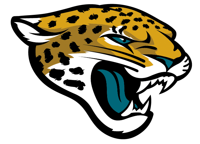
A few years ago, the now defunct NFL blog Kissing Suzy Kolber published a logo rankings article written by an actual graphic designer who lamented that so many teams used the same kind of “angry animal face” design. Well, the reason the first angry animal face we’ll be discussing is ranked so low is because it really doesn’t look angry at all. If you’re trying to incorporate anything with a face in your team’s identity, your best move is to either make a straight up cartoon, like the Baltimore Orioles and Boston Celtics, or something a little abstract, like the Minnesota Wild or Arizona Coyotes. The Jaguars fall into an awkward middle ground – their namesake big cat is at once the most detailed and (barring its teal tongue and eyes) realistic animal heads in the NFL, but it’s also the most lifeless. The jaguar in question doesn’t look like it’s trying to devour or terrifying its opponent so much as it’s saying “aahhhh” at a doctor’s appointment and affecting the disinterested and almost uncomfortable visage such an occasion demands.
24. New England Patriots
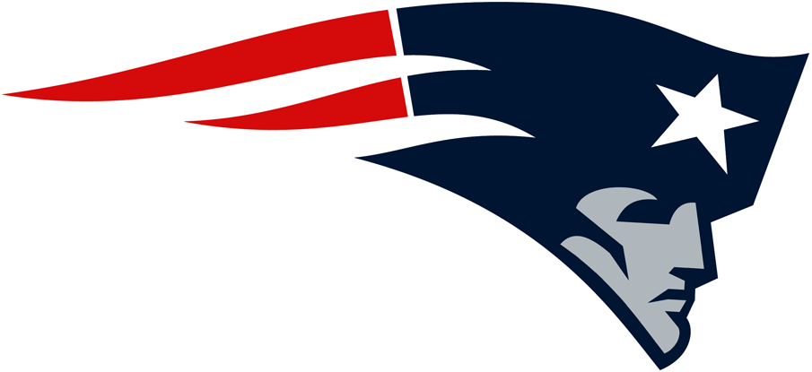
People hated Tom Brady for a lot of reasons – the way he ditched Bridget Moynahan, his alleged political persuasions, and, of course, his (alleged) attempts at cheating – but perhaps biggest of all was that he not only won constantly, but did so in the most boring and personality-devoid way possible. In that sense, the New England Patriots’ stoned-faced logo (nicknamed the “flying Elvis” when it was first adopted) is the perfect representation of the Brady/Belichick era – ruthlessly efficient, but achieving the greatest heights of professional sport with all of the joy of a typical DMV employee. The stars and stripes are a nice attempt to save the logo and give it some flair and motion, but even the extra color can’t salvage this dour replacement of the much more charismatic Patriot Pat.
23. Philadelphia Eagles
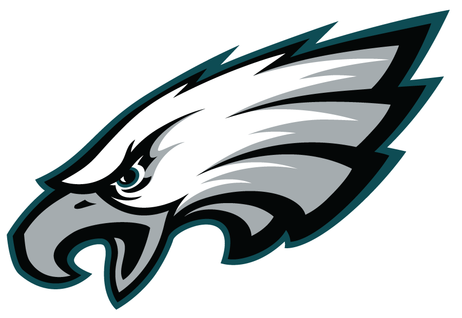
There are some exceptions to the rule, but for the most part, football logos at all levels “face” the right, which allows teams to look like they’re going forward no matter what side of the field they’re trying to score on. The most noteworthy exception is the Philadelphia Eagles’ logo, which, in addition to not being worn on the team’s helmet, faces the left so its neck feathers can form a shape that people claim is supposed to be an “E.” Sports logo history is full of similar hidden, subtle elements that you can’t stop seeing once you notice them for the first time. Unfortunately for the Eagles, the alleged “E” does not qualify because it’s so subtle that it makes me wonder if it even actually exists in the first place or if the designer of this logo was just trying to come up with a convenient excuse as to why the logo was facing the wrong way.
22. Baltimore Ravens
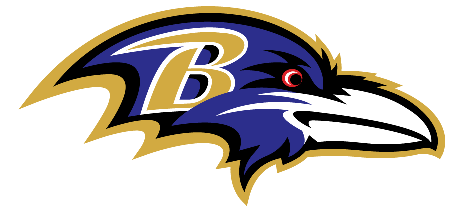
I don’t have anything against this logo, per se, and I’ve always loved the Ravens’ nickname for its connection to Baltimore legend Edgar Allan Poe and because I can think of few scarier noncarnivorous birds than one that forebodes death, But ravens have big, feathery wings, and they’re black, not purple, and also it really feels like they put the “B” there so the head wouldn’t look too tiny. A little too self conscious to be higher up on the list.
21. Denver Broncos

Once again, I don’t have too much against this logo – the bronco’s flowing mane gives us a good sense of forward motion and even though I haven’t seen many horses with white skin and orange eyes, it’s a more subtle incorporation of the team colors than the teal jaguar tongue. But do horses really run with their mouths agape like that? It seems like that would cause some unwanted drag.
20. Seattle Seahawks
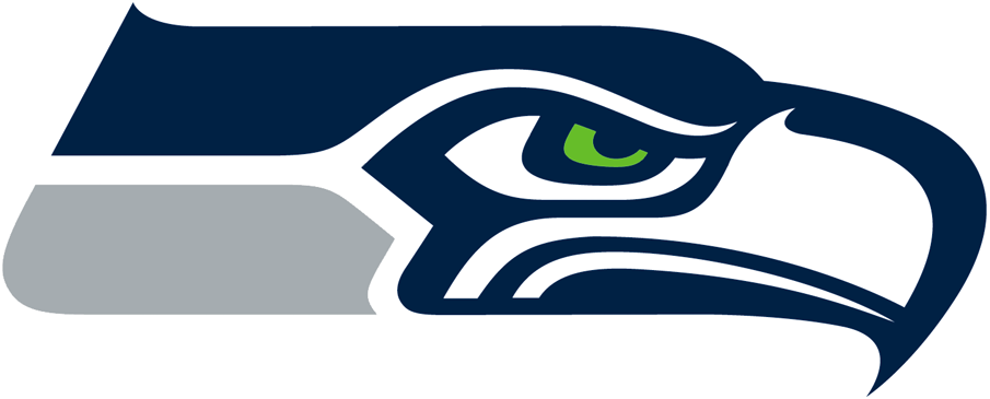
Despite some tweaks to the shades of blue, silver, and green used on their logo and uniforms, the Seahawks have had a pretty consistent identity since their first season in 1976. I love the concept of the logo, which is designed after the art of the Kwakwaka’wakw people, perhaps the most tasteful way possible to pay tribute to a region’s Native American heritage without also being accidentally problematic. But as time has gone on the Seahawk has developed a furrowed brow and a bit of a scowl, perhaps an upgrade from the dead-eyed original, but still a little too cartoony for my tastes.
19. Arizona Cardinals
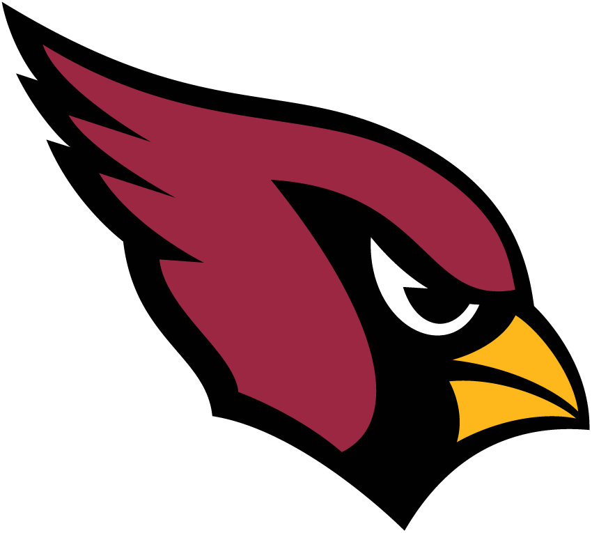
My favorite of the angry animal head logos because it’s simultaneously the simplest and most difficult to pull off. Cardinals are very pretty, but they aren’t particularly intimidating (the team was originally named after the shade of red, not the bird), which makes naming your football team after them a tricky proposition. The Arizona design team pulled it off though, turning a logo that was originally a little proportionally unbalanced and turning it into something sleek and determined.
18. Los Angeles Chargers

Poll a random sampling of NFL fans, and a significant portion of them will tell you that the Chargers’ baby blue uniforms are the best in the NFL – a perfect blend of SoCal sunshine and Hollywood flash. The uniform’s lightning motif is a big part of that, and acted as the perfect symbolic representation of the high-power Phillip Rivers and LaDanian Tomlinson lead offenses of the mid-to-late 2000s. But as a stand alone logo to use on clothing and merch, it leaves a little bit to be desired – placed on a T-shirt or a mug, it can start to look like a spiky blonde toupée. The helmet and uniforms are still aces, but if the Chargers really wanted a fresh look for their new stadium, they should’ve made the horse shield their primary logo.
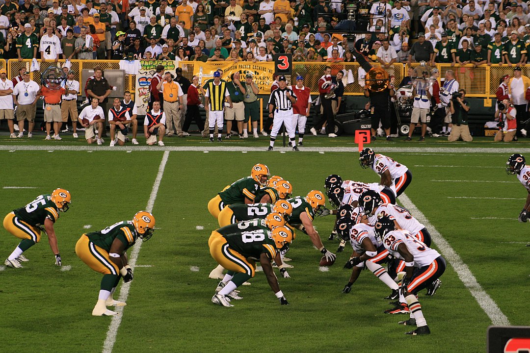
17. Green Bay Packers
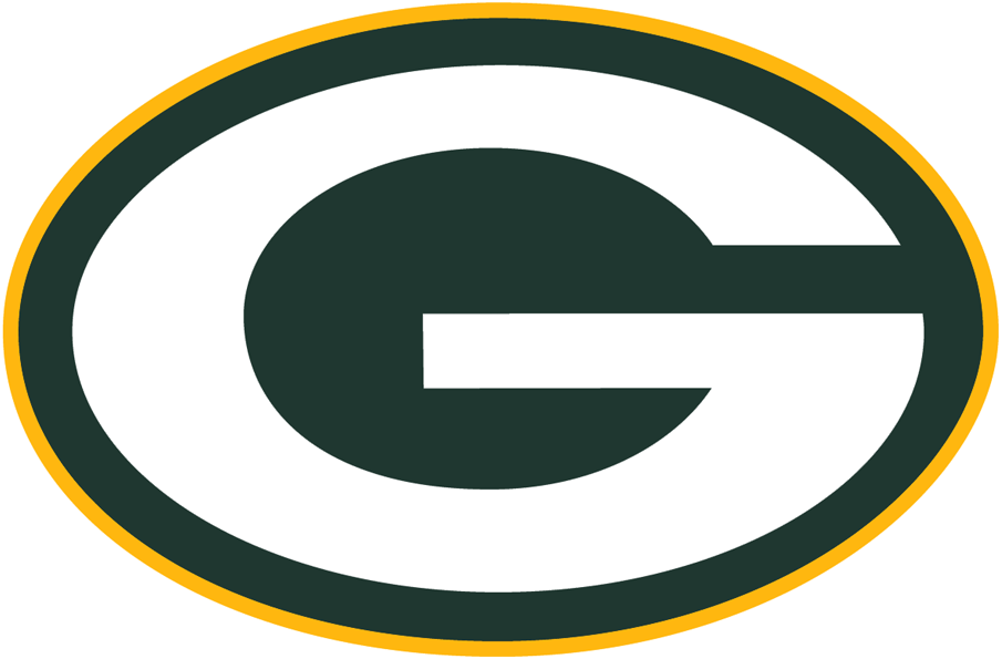
The Green Bay Packers is one of those logos that would be boring if it weren’t associated with such a storied franchise, and while it might not be the most exciting mark in the league, it’s had an undeniable influence, with college teams like Georgia and Grambling State literally paying a licensing fee for the right to use their own versions of it. “G” is kind of an awkward letter, but the oval that encases this one gives it roughly the same proportions of a football, making it look compact, distinguished, and powerful. For a while, there was a common misconception that the “G” didn’t stand for Green Bay but for “greatness,” an urban myth debunked by multiple sources. Thank goodness, because if that were actually the case, it’d be nearly as obnoxious as most of Aaron Rodgers’ recent behavior, and cause enough to rank it way, way down the list.
16. San Francisco 49ers
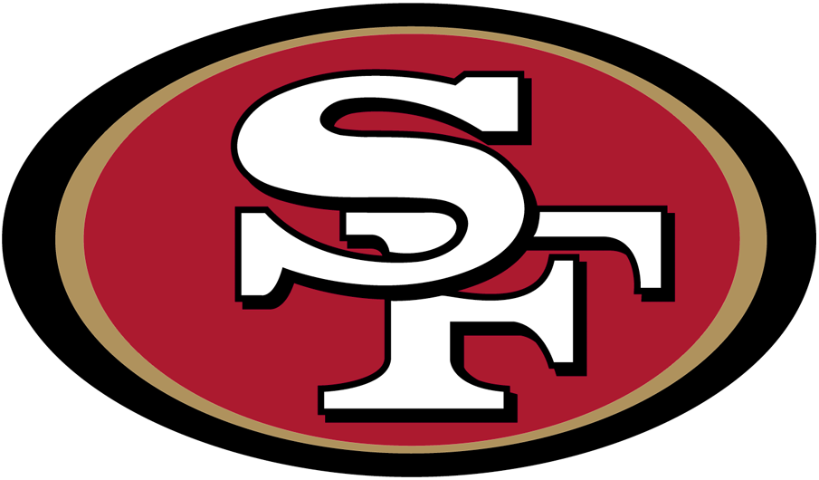
Another simple logo that wouldn’t be ranked so high if it weren’t associated with the likes of Joe Montana, Jerry Rice, and Ronnie Lott. The black border has always bothered me a little bit, but if the Niners’ old logo is any indication, the key simplifying mark might be removing the superfluous gold inner ring.
15. New York Giants
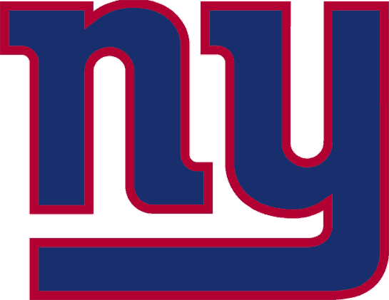
It has always amazed me that this logo was first introduced in 1961 – its lowercase letters feel very stylish and techy, like the logo of a hot new New York dating app. I’d place this logo a lot higher on the list if it weren’t for its red outline, which adds too much heat to what’s an otherwise cool and clean mark. Thankfully, the white version worn on the Giants’ helmets eschews the border.
14. Atlanta Falcons
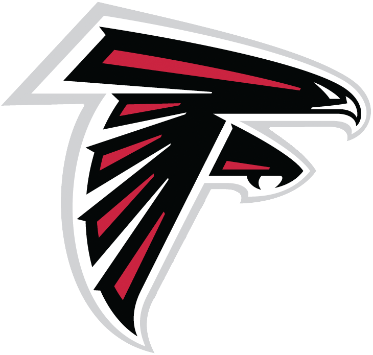
Introduced in 2003, this Falcons logo is a solid update of their original, kind of goth mark that manages to be modern while staying abstract and, of course, giving a sense of speed. Talons bared and eyes narrowed, it’s ready to swoop onto its unlucky prey. My only complaint? When lined up with the Falcons’ old logos, the forward tilt looks kind of silly. Thankfully, those old logos aren’t also on the Falcons’ helmets.
13. Kansas City Chiefs
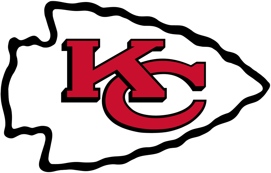
I’ve talked a lot about football logos needing to convey a sense of forward motion, and it doesn’t get much more forward than a literal arrow pointed in the direction of your opponents. The only two things you can really say about this logo is that it looks kind of plain against a non-red background and that it’s just another example of the questionable history of using Native American imagery/stereotypes in sports identities. But compared to the old identities of the Cleveland Indians or the Washington Redskins, it’s fairly tame.
12. Indianapolis Colts
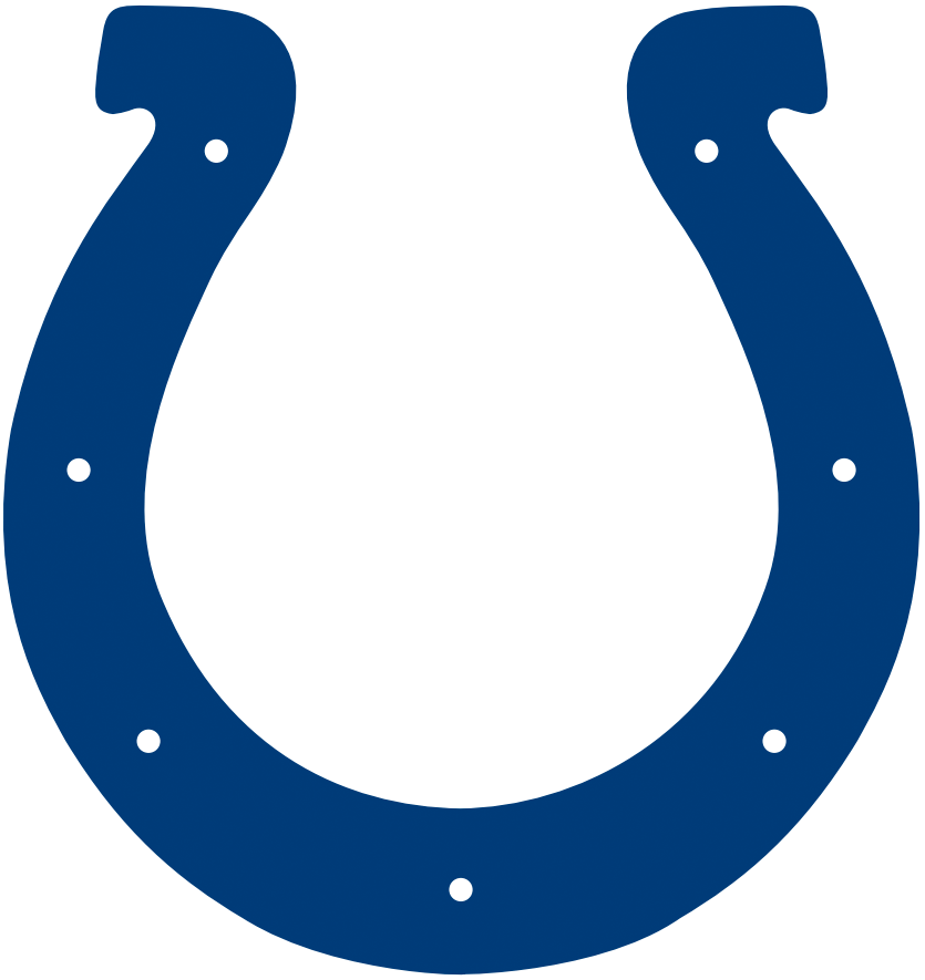
Sometimes it can be tough to incorporate a team’s colors into its logo while also effectively evoking its mascot – if you keep it abstract enough you can make any animal any color you want, but overthink it and you end up with a teal-tounged jaguar (have I mentioned how much I hate that logo yet?). The Colts’ blue horseshoe may not meet every farrier’s approval, but it’s clean, simple, and a classic symbol of rustic Americana. Plus, it’s like wearing a good luck charm on your head!
11. Dallas Cowboys
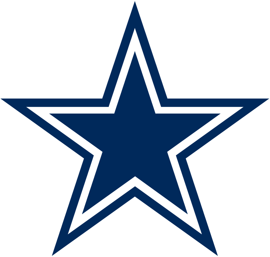
In the novel Billy Lynn’s Long Halftime Walk, Ben Fountain uses the Dallas Cowboys as a microcosm of the bloat and excesses of American culture, a past its prime institution obsessed with celebrating itself. Like any non-Cowboys fan, I can’t help but agree with that assessment of this franchise – but I also can’t argue with its iconic blue and silver star, another great American symbol. It’s also a little bit self-congratulatory and self-regarding, but I’m sure team owner Jerry Jones wouldn’t have it any other way.
10. Minnesota Vikings
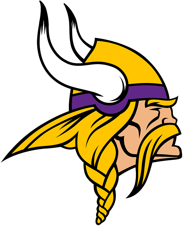
The human version of the angry animal head, what sets this logo apart is the impressive amount of detail in the braids, hair, and mustache. Considering the heavily Scandinavian heritage of Minnesota and the rest of the upper Midwest, the Vikings nickname is one of the best in the league, as well. What keeps it at only number ten, though? The viking kind of looks like he’s sleeping!
9. Tampa Bay Buccaneers
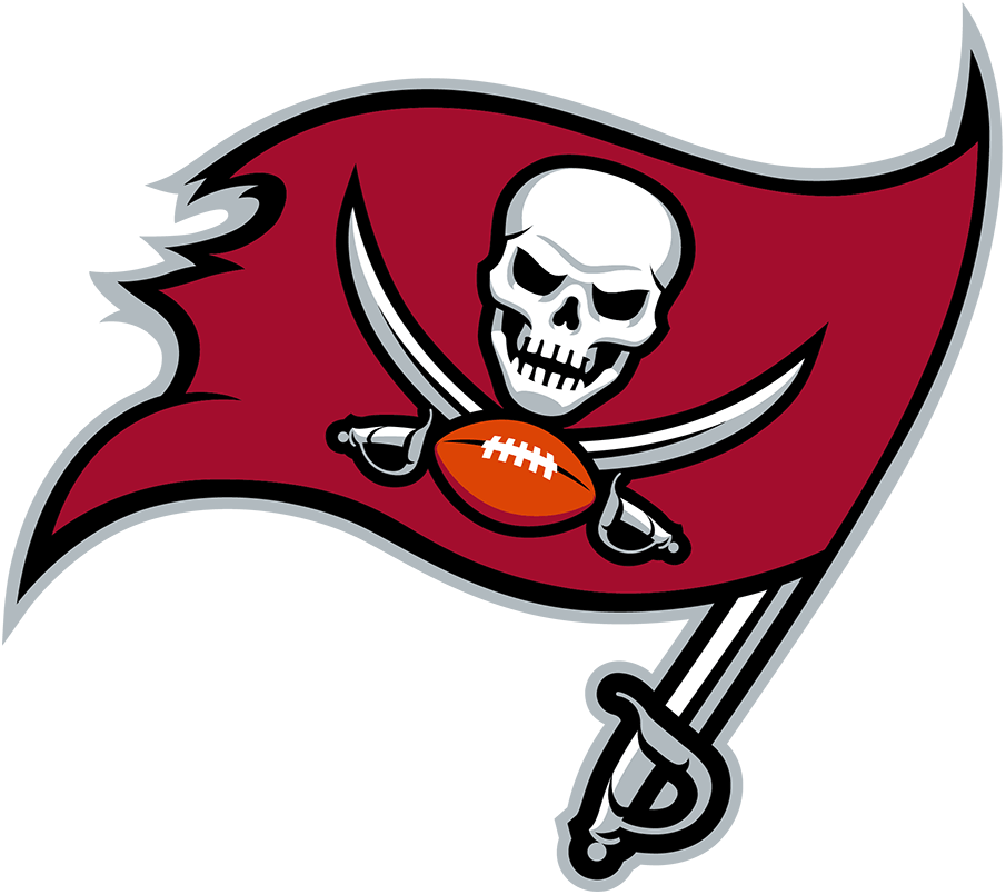
One of the worst things a logo can be is too busy – there’s a fine line between a well orchestrated collection of compelling details and a cluttered mess. The Buccaneers jolly roger – one of the few exXxtreme 90s rebrands that has actually aged well – is a perfect example of how to do a lot of different things tastefully. We’ve got a tattered red flag, a skull, crossed swords, a football, AND a third sword where the flagstaff should be, and yet everything feels tidy and compact. A lot of NFL logos go for sleek, but there’s a certain swaggering menace to this logo that sets it apart – the Buccaneers want to bowl you over and sneer at you once you hit the ground.
8. Carolina Panthers
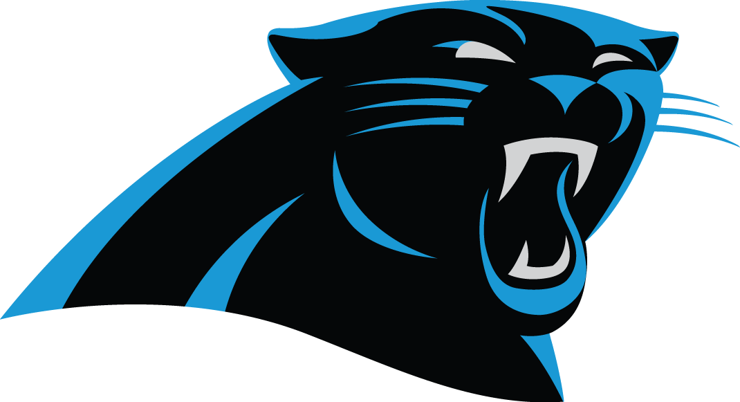
One of my first logo loves. I was so obsessed with the original Panthers logo and uniform as a five-year old that I convinced my parents to buy me, a Jets fan from New Jersey, a Kerry Collins jersey. The decision to lop the panther off at the shoulders might strike some as odd, but to me it’s a perfect way to keep the animal expressive and abstract, and a beautiful combination of the panther’s black coat with the team’s Carolina blue.
7. Chicago Bears
Is there a better, weirder sports-logo letter than the iconic wishbone “C?” Try to write an actual word with a wishbone “C” that looks like this and it’ll turn out insane – but slap it on a football helmet or a baseball cap and it looks perfectly normal. The Reds and Twins both pull it off with aplomb, but I think it works best for the Bears because there’s something runic and primitive about it, a symbol you might find etched on a cave wall, warning you that a fearsome Monster of the Midway lives nearby.
6. Detroit Lions

The best logo for a team named after an animal, the Lions logo is not only an effective use of an animal’s entire body, it also evokes a defensive player lunging at an opposing quarterback, an illustrative blend of species and sport. It’s a shame that the Lions’ on-field product hasn’t lived up to their logo’s promise.
5. Houston Texans
If we’re being honest, “Houston Texans” is probably the least creative name in the NFL, and it’s only made worse when you realize that there’s another, much more popular and successful football team located in Texas. But the Texans made the most of their middling nickname with this logo, which sees the iconic Texas state flag folded into the shape of a bulls head. It’s ostentatious, combative, and fiercely provincial – in other words, it’s extremely Texas.
4. New Orleans Saints

You could argue that the Saints’ logo is a little bit of a cop out since, outside of its colors and borders, the designer just had to adapt the fleur-de-lis, a heraldic French symbol used to represent French saints. But in that way, it’s also the purest idea of what a sports logo should be – a unique signifier of a city and community, something that would look wrong if any other team in the league tried to adapt it. And unlike some other logos, it looks good in multiple colors, shining through as gold in the primary version and providing a nice bit of contrast in black when used on the team’s helmet.
3. Pittsburgh Steelers
Another logo that could only ever be used in one U.S. city, the Steelers iconic mark is adapted from the “Steelmark,” a logo designed to advertise, well, steel by the American Iron and Steel Institute in the early 1960s. AISI were actually the ones who approached the Steelers about using the logo first, making this one of the first examples of sports based product placement, but at least it’s an honest advertisement. Pittsburgh is a city built by steel and steel workers, and the team’s name alone brings to mind images of people getting together after a long day at the mill to play some football and blow off some steam. It’s a reminder of what sports should be – a common experience that brings a community together and allows them to celebrate their local identity, a common cause that can bring together steel executives and steel workers alike.
2. Las Vegas Raiders

They may have struggled to stay relevant in recent years, but in their 70s heyday, the Raiders were the bad boys of the NFL. Players like Jack Tatum, Ken Stabler, and Ted Hendricks played with an edge that spat in the face of clean cut legends like Bart Starr and Johnny Unitas, while owner Al Davis antagonized the league brass with every opportunity he got. This sketchy reputation even seems to have trickled down to their logo and uniforms. The intimidating combo of black and silver needs no further explication (it’s popularly believed that Davis chose those colors because he was colorblind and wanted to see his team the way everyone else did, but I couldn’t find any reputable source to back this up), but the Raiders shield is subtle in its brilliance. While it ostensibly shows a “raider,” what it really shows is a football player as Raider Nation has come to expect them – battle scarred but slightly smirking, ready for the next fight, even if he doesn’t have a facemask. He may look worse for wear, but we know exactly what’s going through his mind – “just win, baby.”
1. Buffalo Bills
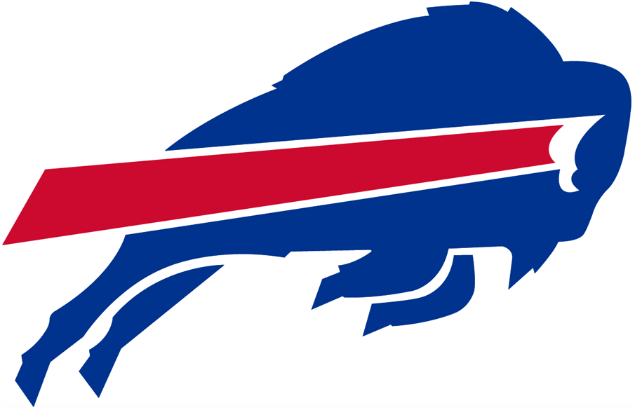
The Buffalo Bills may have lost a heartbreaking AFC Divisional Game to the Chiefs last month, but they should be heartened by the fact that I, the logo expert, have deemed their logo the best in the NFL. Thus far I’ve written a lot about motion, speed, abstraction, and the need of a logo to represent its city, and this mark has all of those things in spades. The buffalo is hurtling forward, so fast that he’s leaving a red slipstream behind him, and he’s got just enough detail to be recognizable, but not enough to come off as awkward or goofy. What’s more, when you say out loud what this logo is, you’re literally saying the name of the city. Speed, power, adaptability, and a sense of community – it doesn’t get much better than the Buffalo Bills’ buffalo, in any sport, in any league, in any era.