All 32 NHL Logos – Ranked
Back when I ranked all 30 Major League Baseball logos, I talked about how my early interest in sports as a child was really an early interest in logos and uniforms. What I left out is that the NHL, more so than the two leagues whose logos I’ve already ranked, was the sport whose visuals fascinated me the most. I’m sure there are a number of factors that made this the case – my father had easy access to Rangers tickets through work, making going to hockey games some of my earliest pro sports memories, and a Brian Leetch jersey one of the first pieces of sports merch I ever owned (or at least remember owning).
My early childhood was also an exciting time for branding in the NHL – four new teams joined the league between 1998 and 2000, and they came with edgy names like the Predators and the Thrashers, and with logos that were a natural entry point for a kid like me who was also obsessed with animals and prehistoric creatures. Even preexisting teams like the Mighty Ducks of Anaheim and the Phoenix Coyotes had modern, even-cutting edge brand identities that captured my attention, and hockey teams’ tendencies to wear large versions of their logos right on their chest made their marks impossible to ignore. Add the NHL’s third jersey initiative into the mix, which introduced some creative and occasionally regrettable designs into the league, and the NHL of my youth was a logo obsessive’s dream. I even made my parents buy me a beach towel with all 30 team logos on it – a towel that I’ve stopped using, lest I damage what’s become something of a sports design time capsule.
So, in celebration of the Vegas Golden Knights first ever Stanley Cup title, I decided to put my ranking hat on again and list every logo for the now-32 teams in the NHL, from worst to first. It’s a truly fascinating mix of marks that have been used in one form or another since the early 20th Century and those that have only been introduced in recent years, a true survey of how owners and executives have felt like a sports team should look through a whole range of eras. So, without further ado, let’s drop the puck and see what placed where:
32. Anaheim Ducks
My gripe with the Ducks’ logo has less to do with the logo itself than with the logo that the team could have. The team was initially known as the Mighty Ducks of Anaheim, and sported the iconic and unique “Wild Wing,” a duck shaped goalie mask backed by crossed hockey sticks, a puck, and a jade triangle – I loved it so much as a kid, I had a poster of it up in my room. It was a perfect bit of cross-marketing for Disney, the team’s original owners, who named the real life hockey team after the series of kids’ movies of the same name, and later released an animated series about alien-fighting, hockey-playing anthropomorphic ducks that I found much more interesting.
Anyway, after Disney sold the team in 2005, the new owners decided to move away from the very 90s uniforms (the Mighty Ducks’ other primary color was “eggplant”), adopting a black, gold, and orange color scheme and a wordmark as the primary logo, which would be replaced in 2013 with just the duckfoot-shaped D. Again, it’s not awful logo (although I do wonder how many people pick up on what exactly it’s supposed to be), but it’s got nothing on Wild Wing, which the team currently wears on their alternate jersey. Bring ‘em back full time, I say.
31. Chicago Blackhawks
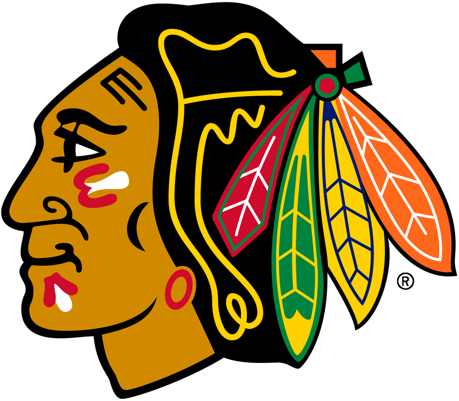
Ah yes, it’s time for that inevitable moment in sports logo rankings where we must discuss a poorly aged Native American-themed team name/identity. I’ll admit, I’m a bit of a traditionalist when it comes to these things – but as a non-Native American, my opinion is the least important when it comes to discussing this issue. Compared to the Cleveland Indians’ (since renamed the Guardians) old Chief Wahoo logo, the Atlanta Braves’ “tomahawk chop” chant, and the Washington Redskins (since renamed Commanders) entire thing, the Blackhawks’ primary logo is a little less egregious. But nearly every Native American organization has called for it to be retired, as have the descendants of Black Hawk, the Sauk leader depicted on the logo (the team itself is named after the 86th Infantry Division, nicknamed the “Blackhawk Division” after Black Hawk, and which team founder Frederic McLaughlin served in during World War I). I have to confess to having a bit of a soft spot for it, but when the NHL tried to conceal a version of the logo while promoting the 2020 reverse retro jersey collection on Twitter, I decided I was out. Clearly somebody in the league front office knows this logo is a bad idea, but they don’t have the guts to convince the Blackhawks to make a change – which is almost worse than the team itself keeping the logo.
30. Columbus Blue Jackets
I have nothing against the Ohio state flag, silver stars, or the letter C, but mix them altogether and you get a logo that isn’t subtle so much as it is confusing. The flag is too titled to make the C shape it’s striving for, and the presence of the star doesn’t add much, while neither elements convey what a “blue jacket” actually is. The team name, as it turns out, is a reference to the large number of Ohioans who fought for the Union during the Civil War (more than any other state), something their cannon-themed alternate mark makes a bit clearer. At least they didn’t stick with the logo they were considering as their primary when the team identity was first unveiled, which led a young Michael to believe that there was a darker hued cousin of the yellowjacket who threatened to both sting and bodycheck him.
29. Colorado Avalanche
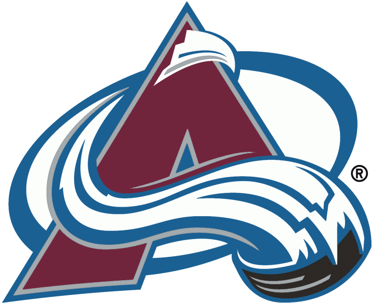
Given that it’s been worn by three Stanley Cup winning teams and some of the greatest players in this history of the game, I don’t get the sense that the Avalanche will be moving on from this logo, which depicts a puck leaving a trail of powdery snow as it sleds down a maroon, A-shaped mountain, anytime soon. But it is a little busy and 90s for my 21st century tastes, and one wonders if, had Joe Sakic, Patrick Roy, and now Nathan MacKinnon and Cale Makar not made this logo the symbol of quality hockey that it became, if the team would’ve moved on and made their Colorado Rockies (the hockey team, not the baseball team)-inspired alternate their primary. Or maybe they’d make young Michael happy and finally put the abominable snowman foot on the front of the jersey. Colorado Yetis – has a nice ring to it!
28. Carolina Hurricanes
I used to like this abstract take on a tropical storm, but then someone pointed out to me that it kind of looks like a swirling toilet bowl, and now I can’t unsee it. Finding a way to put their secondary storm signal logo on their primary red uniforms might be a nice change, but most hockey fans will never forgive the Hurricanes from taking the classic Hartford Whalers mark off the ice for good.
27. Minnesota Wild
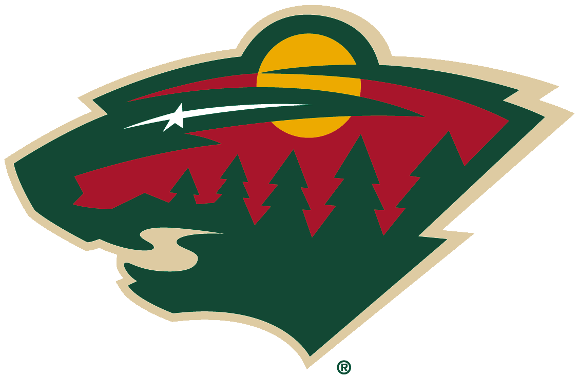
As a writer, sometimes you write a florid, overlong lead to a story and convince yourself that it’s the greatest thing you’ve ever composed, only for an to editor step in and (correctly) ask you to cut it down. I feel like something similar must’ve happened with whoever designed the Wild’s entire landscape of a logo, except no supervisor or team executive stepped in and asked them to dial things down a bit.
The problem starts with the uncertainty regarding exactly what kind of animal’s head is made up of the forest depicted. Even the team doesn’t know, describing it simply as a “wild animal.” The little touches – North Star as eye, stream as mouth, full moon as ear, are clever enough, but they’re undercut a little bit by the rows of trees, which serve no clear purpose. Still, I suppose the artist deserves credit for turning such a nebulous team name into any kind of logo in the first place.
26. Nashville Predators
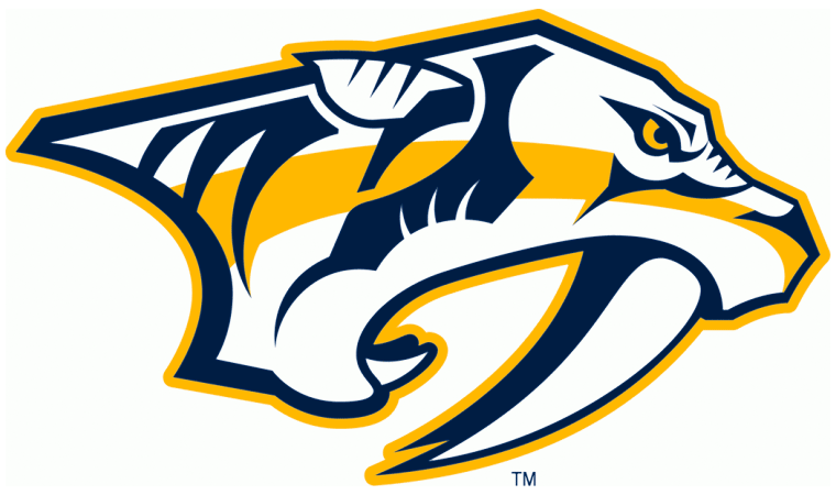
I have no doubt that I would be very afraid if I somehow came across an actual saber-toothed tiger (also known as a smilodon, if you want to get scientific), but the version that adorns the Nashville Predators’ jersey looks a bit too goofy and buck-toothed to be truly intimidating. Its unnaturally jaundiced complexion doesn’t help either, nor does the fact that the logo is facing to the side like a football logo, as opposed to forward, like a hockey logo (they tried to remedy this with an alternate jersey to middling success). But if a logo can’t be good, it better be interesting to children, and, as someone who was only four years old when the Predators entered the league with a slightly different logo, I can assure it succeeds in that regard.
25. Seattle Kraken
So two things with this logo:
- I’m very confused as to whether or not I’m looking at one tentacle and a big, unrelated S or two tentacles. The bottom of the S part on the far-left is kind of tentacle shaped but lacks the suckers of the second part. I can’t tell if that’s because we’re seeing the outside of the tentacle or it’s not a tentacle at all, and if it’s not a tentacle I don’t know what it’s supposed to be.
- I woke up late the day they released the logos and uniforms for the Kraken (the team has only been around for two seasons), and the first version I ever saw of the logo was this edited one, in which a pair of googly eyes are placed atop it to make the scary red eye look like a goofy red tongue. Even though I am now well acquainted with the actual logo, my mind still sees a tongue before it sees an eye, which ruins pretty much any intimidation factor this logo might have.
24. Winnipeg Jets

When I was in high school I took a class called computer applications, where we learned how to be power users of the Microsoft Office and Adobe suites. One of our projects was to create a new brand identity for a company using PowerPoint and Photoshop, and my partner and I decided to create a bold new logo for BMW that turned the blue parts of their logo green (because of electric cars and the environment) and put a four-pronged propeller in the middle of it, to harken back to their history as an airplane engine manufacturer (not a very good thing to emphasize, in hindsight). I bring this up because the logo of the revived Winnipeg Jets has a similar “let’s put the thing on top of the thing” vibe, with a fighter jet placed on top of the Royal Canadian Air Force’s roundel. It feels both lazy and busy, and the little, northward pointing cut out at the top of the outer circle, meant to indicate where Winnipeg is in relation to most of the NHL’s teams (that is, North) and the name of the team’s ownership group (True North Sports and Entertainment), feels a little redundant.
23. New York Islanders
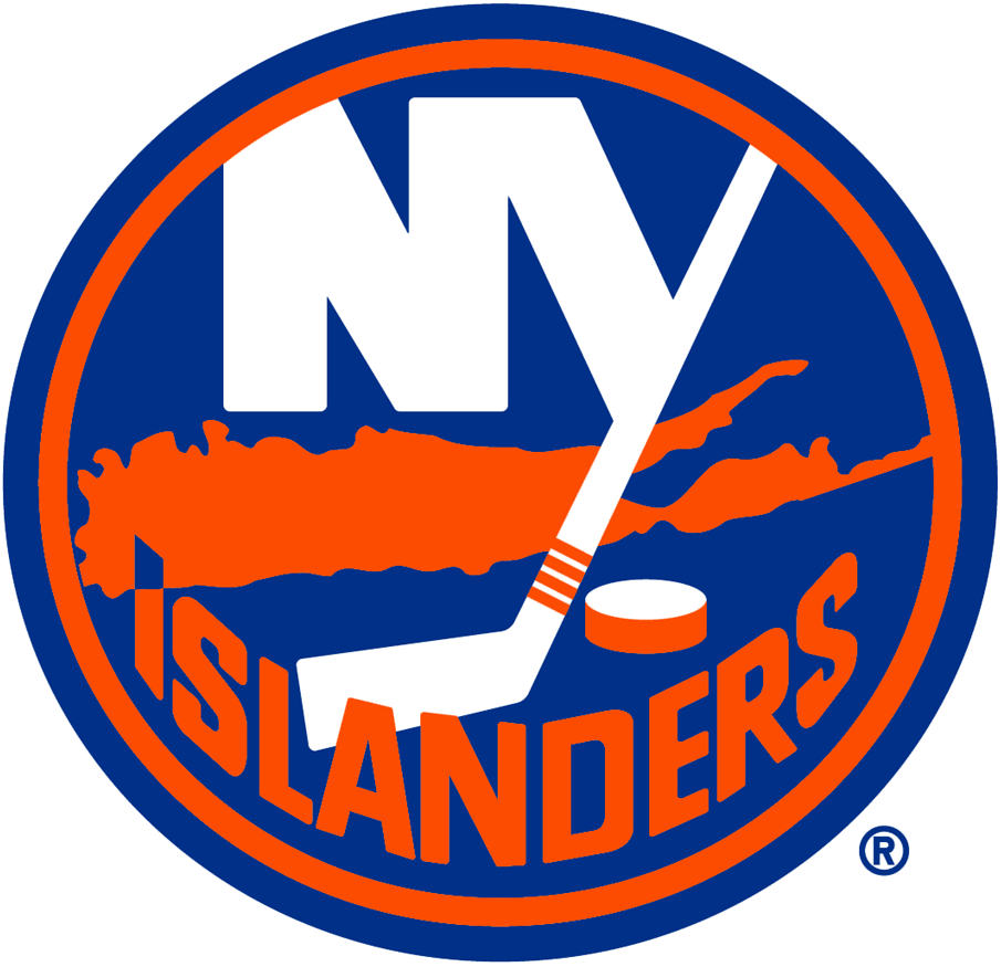
From a technical perspective, this logo is way too busy – the team name at the bottom can’t even fit without overlapping on the weird outline of Long Island! – but it has history on its side. An earlier version of this logo was worn by the authors of what may have been the most dominant four year stretch in league history, in which the Islanders won four consecutive Stanley Cups (the last team in any major North American league to do so) and 19 straight playoff series between 1980 and 1984. Those four Cups are symbolized by the four strips of tape on the hockey stick, a detail even a salty Rangers fan such as myself has to respect. It doesn’t make the logo any less cluttered, though.
22. Washington Capitals
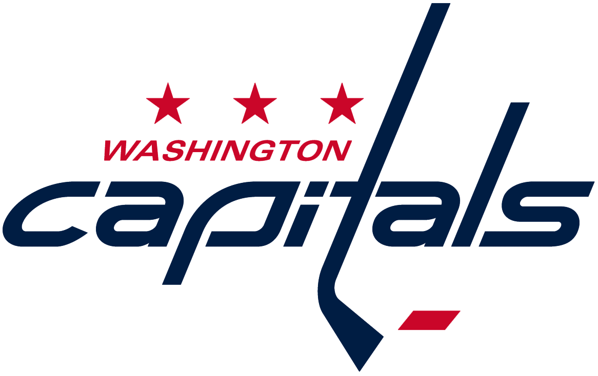
I actually like the way this logo looks on the Capitals’ primary jerseys, but as the main signifier of the team, it leaves me a little wanting. The font is too skinny and brittle, and the wordmark too wide, which makes it hard to compactly plaster on team merch like a baseball cap or keychain, and its half-hearted incorporation of the DC flag is so subtle most people probably won’t even notice it. Like the Islanders’ logo, it’s become so familiar that I would never suggest the team change it even though, unlike the Islanders, the Capitals didn’t have much success until the last 25 years or so. The secondary eagle logo, which also includes a negative space U.S. Capitol, is much more interesting, but wouldn’t look as good across a jersey.
21. Tampa Bay Lighting
One the one hand, this is a very clean and simple logo that successfully depicts the team’s name. On the other hand, it looks like the logo that some knockoff superhero would wear on their chest, or – when displayed on a blue jersey over blue shorts – superhero footie pajamas a kid might wear. Also, the minimalist blue and white design kind of rips off the Maple Leafs’ whole thing.
20. Vancouver Canucks
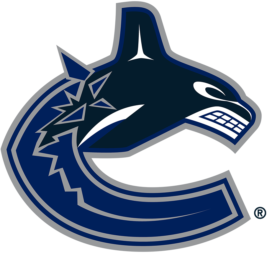
We’ve now entered the part of the rankings where we get to logos that I think are just kind of ok, starting with this one from the Canucks. Unlike the Blackhawks’ logo, the Canucks primary mark stands out as a good way to honor the indigenous culture of an area (the design of the orca was influenced by the art of the Haida people, who inhabited British Columbia) – but it also has little to do with the team name, and the muted color scheme prevents it from standing out when lined up with all of the other logos, which is why it only goes as high as 20.
19. Vegas Golden Knights
There’s not a lot of bad to say about this logo – the helmet creates a cool “V” with the negative space, and the background being a shield instead of a generic shape is a nice touch. Like another team we’ll get to later, Golden Knights owner Bill Foley is an Army veteran, and had hoped to name his team the “Black Knights” in honor of West Point’s athletics teams, but that decision was poo pooed by Army officials. I think it worked out for the best though – there’s already another team with black jerseys and a medieval theme, and the gold in the Knights’ name and jersey reflects a little bit of Nevada history (ironically enough, the SIlver State is the highest producer of gold in the country). That said, the helmet’s design gives me more of a gladiator feel than a knight one, reminds me way too much of the logo for Deadliest Warrior. Remember that show? 16-year old me loved that show, even though it was pretty depraved in hindsight.
18. Dallas Stars
When you play in a city nicknamed “The Big D,” and your name is the stars, a giant D over a giant star seems like one of the better concepts you’re going to get for a logo. I do wish there was some element that gave it more of an Old West vibe, and the big black shadow in the middle of the D is a little distracting. That said, the Stars’ attempts to add an Old West theme, such as their neon green Texas jerseys and the infamous “mooterus” logo, have not always turned out well. Imagine this as some big, obnoxious cowboy belt buckle and it works a little better.
17. Edmonton Oilers
Plain by most modern standards, one thing I’ve always appreciated about this logo is how much it looks like it belongs on the side of a gas station – appropriate, given the team’s name and the economy of Western Canada. It does get some points off for being similar in color and concept to the Islanders logo and sporting a font that screams 70s, but most of them are recouped by the fact that it was worn by another dynasty and the greatest player of all time (Wayne Gretzky, for those of you who know nothing about hockey).
16. Calgary Flames
This logo has the same facing-to-the-side problem that the Predators’ logo has, but the flames tailing the C give it a sense of speed and motion that makes up for the awkward position (also, there’s no way to make a C face forward). There’s also a fun little irony to having a hockey team named after something that would destroy a hockey rink’s playing surface. For anyone curious, the team was founded in Atlanta, and named after the fires set in the city during Sherman’s March to the Sea. I’ll leave the question as to whether or not that’s offensive, and if so, to whom, for others to figure out.
15. Arizona Coyotes
Like the Canucks, the Coyotes have a logo that uses an indigenous art style in a creative – and as far as I know, respectful – way. The head situation is a little odd though – I can’t tell if the coyote is winking at me or if there’s a Two-Face situation going on. I do wish the uniform this logo is worn on reflected its vibrancy and wasn’t so dark, but given that the Coyotes are unlikely to stay in Arizona for much longer, my guess is the team won’t be in a rush to update any part of their identity any time soon, at least not until they move to Hartford or Houston or wherever else they end up.
14. Los Angeles Kings
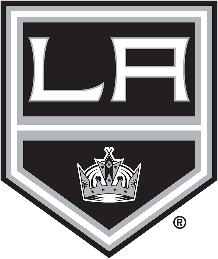
I like the idea of a team called the Kings using a shield/coat of arms style logo, but the “LA” always felt a little plain to me, especially when compared to the relatively detailed crown below. In fact, the Kings’ entire identity could probably use a little bit more color as a whole. Unless paired with a strong accent color like yellow or red, black hockey jerseys bore, especially when contrasted with the stark white ice of a hockey rink. That said, what the Kings wear now is much better than the gaudy gold and purple uniforms they broke into the league with. Still, I’d be curious to see them try and make a more modern version of the coat of arms logo from the late 90s.
13. Ottawa Senators
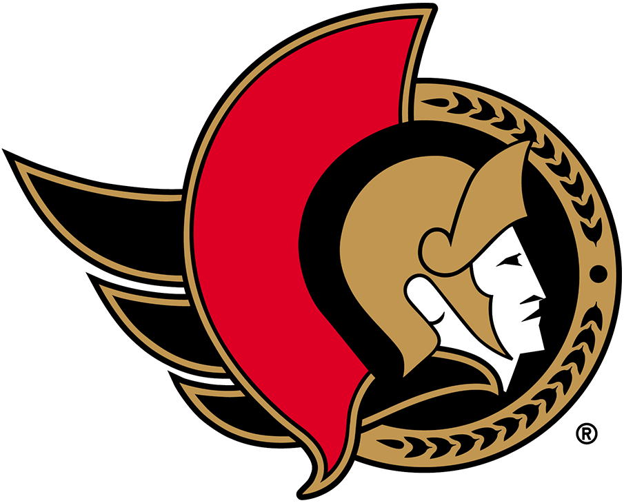
I didn’t mind the logo the Senators used from 2007 to 2020, in which the Roman centurion was facing the opponent, but I also enjoy the 2D profile version, which they wore from the team’s founding until 2007, before reintroducing it a few years ago. The little black feathers at the end feel a little superfluous, but give the logo a sense of motion it might otherwise lack. And for those of you wondering, yes, Canada does in fact have a Senate.
12. Florida Panthers
The Panthers’ original logo is very much the launching- at-the-opponent-in-front-of-you kind of mark I’ve been asking other teams for, but I quite enjoy this more regal, refined logo that they introduced in 2016, which emphasizes the majesty of their namesake rather than its ferocity. The “Panthers” word mark and red band, which is also worn on either side of the team’s primary jersey, are modeled after the tab worn by the U.S. Army Rangers, of which team owner Vincent Viola is a former member.
11. San Jose Sharks
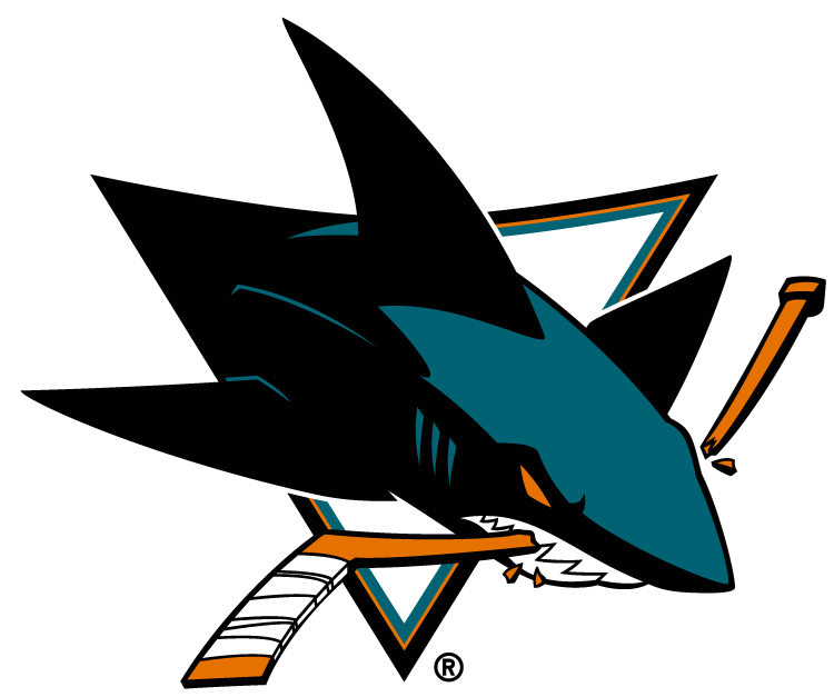
A pretty perfect mixture of name and sport – this shark isn’t just going to beat you at hockey, it’s literally going to wreck your game by chomping up your hockey stick and rendering you defenseless. Sometimes a team’s attempt to update but not entirely overhaul a logo can be result in some offputting results (looking at you, Jacksonville Jaguars), but the Sharks hit the nail on the head when they updated their primary mark in 2007, taking what had been a somewhat expressionless mascot and replacing with a snarling, oranged-eyed menace. And unlike a lot of other animal logos, it’s kind of facing towards you, so you know he means business.
10. Philadelphia Flyers
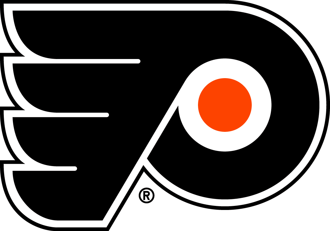
Apparently this is supposed to be a very stylized P, but I love it as an abstract 70s-thing, a weird mix of wing and roundel that doesn’t depict anything specific but gives you a vague idea of what a “flyer” is (something that goes so fast it’s impossible to make out, apparently). This logo is also a testament to how early success can make an unusual, even outdated design stick around – the Flyers became the first expansion team in NHL history to win the Stanley Cup when they did so in 1974, which likely helped their undeniably 70s color combo of black and orange endure well past the Ford years and into the modern era. Kind of reminds me of another citrus-hued uniform worn in the cold.
9. New Jersey Devils
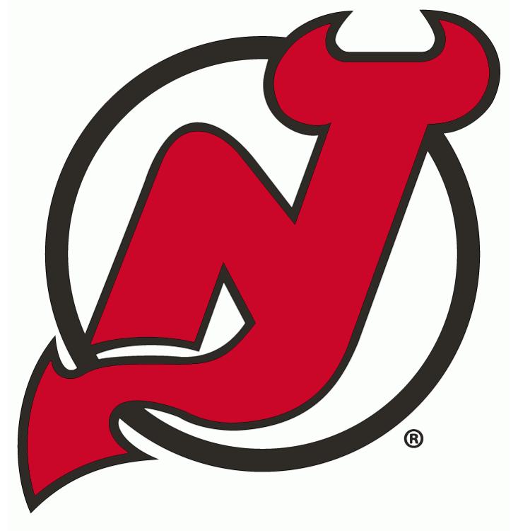
As a Rangers fan, I am obliged to forever hate this team, even though they represent my home state. But one thing I can’t hate about them, at least from a design perspective, is this logo – the simple but unmistakable devil subtly shaped like the letters “NJ” (pay attention to the wing and you’ll see it) is a perfect combination of place and nickname, and also evokes an iconic piece of local folklore. The circle background also helps the asymmetrical, multi-pronged logo feel centered and grounded, and also adds a kind of a circus feel, as if the devil was jumping through hoops for our amusement. It’s something of a small miracle that this logo never got a more detailed overhaul in the late 1990s or early 2000s, since the team name offers up a range of possibilities, as evidenced by their minor league affiliates in Lowell and Binghamton. Sometimes less truly is more.
8. St. Louis Blues
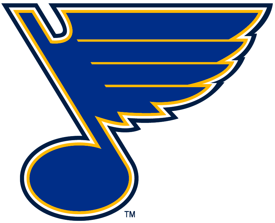
Like the Flyers’ logo, the Blues logo is a great example of an abstract mark matching an abstract concept without getting vague or confusing. The musical note nods at the W.C. Handy song the team is named after, and the feathers at the end of it evoke the speed of hockey. What’s more powerful and overwhelming than music? A Chris Pronger open ice hit, perhaps, but that’s harder to make into a logo.
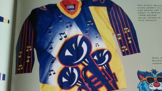
The Blues name is also underrated for the way it immediately provides the team with its primary color, and also doubles as a kind of old fashioned name that just refers to the team’s uniforms (ala the Cincinnati Reds or Stanford Cardinal). Like the Devils and the Flyers, the Blues have also shown that restraint is key, even if head coach Mike Keenan had to (allegedly) intervene at one point in the late 90s to stop them from donning what would have probably been the worst NHL uniform of all time.
7. New York Rangers
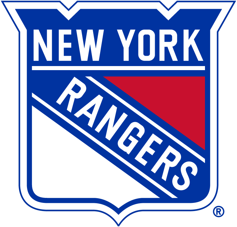
I’ll cop to a bit of homerism on my end with this ranking, but I think there’s something to be said for the longevity of the Rangers’ shield, which has existed in one form or another since the team’s start in the 1920s and conveys the kind of institutional role the team has played in the league’s history. It also dovetails well with the team’s name – unlike the Texas Rangers, there is no non-sports organization called the New York Rangers (originally owned by Tex Rickard, and nicknamed “Tex’s Rangers”), but the official looking shield gives the impression that they’re a crack squad of goal scorers assembled for the sole purpose of winning hockey games. If you don’t want to be disabused of this notion, please do not look at the box scores of their last few playoff games.
6. Montreal Canadiens
I have always found the sense of air of superiority that the Canadiens and their fans carry themselves with to be profoundly obnoxious (they refer to their jerseys as “La Sainte-Flanelle,” literally “the holy flannel”), but like the Rangers shield, it’s tough to deny a logo that’s endured since World War I a top spot. The oblong C is the kind of thing you only ever find in sports (see also: the Cincinnati Reds and Chicago Bears), and the “H” in the middle adds a kind of abstract genius to the mark, even if it does just stand for “hockey,” and not team nickname “Les Habitants.”
5. Toronto Maple Leafs
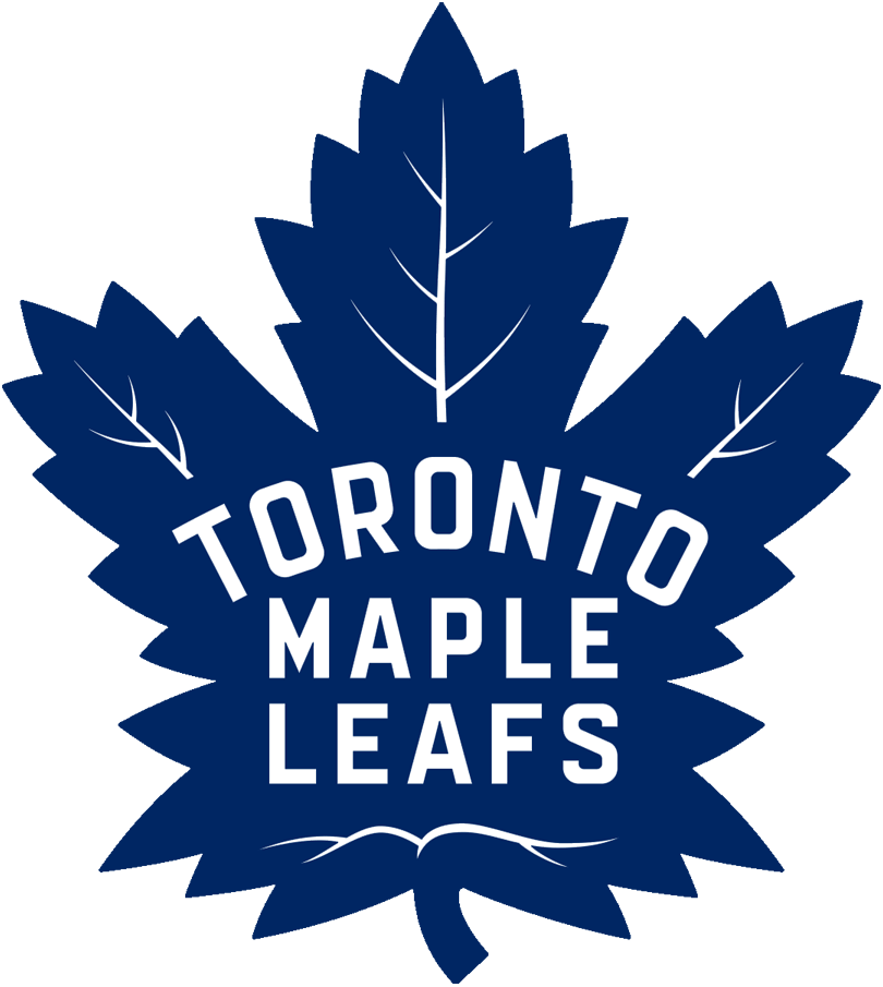
Another Original Six team, another unimpeachably iconic logo that’s been around since the Coolidge Admin– er, 14th Canadian Ministry. Outside of being an unmistakable icon of Canada (in fact, the Maple Leafs predate the maple leaf flag, which wasn’t adopted until 1965), it also acts as a kind of seal of authenticity. While one would refer to a big pile of Canada’s national symbol as a collection of “maple leaves,” the Maple Leafs are employees of Maple Leaf Sports and Entertainment, a kind of professional work around to what I’m sure was originally a grammatical mistake. I used to be partial to the modern, minimalistic version of the leaf that the team wore from the mid-1960s until 2016, but have come to appreciate the more detailed version, which gives the team a sense of old hockey charm and promise of hand-crafted excellence (although, as with the Rangers, do not look at the team’s recent playoff record if you’re looking for any kind of success).
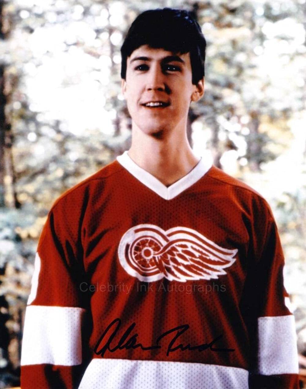
4. Detroit Red Wings
Again, you just have to admire the literal nature of this team name. Rather than be named after a bird with red wings, the Detroit Red Wings are named after the Winged Wheelers, a Canadian sports club one time team owner James E. Norris played hockey for. Far and away the oldest logo on this list, the Red Wings have worn this mark on their jerseys since 1947, during which point it became associated with some of the all time greats, like Gordie Howe, Steve Yzerman, Nicklas Lidstrom, and Cameron Frye. The wheel itself is a perfect homage to Detroit’s history as automobile manufacturing hub, and the wings on either side lend it an almost Grecian quality, as if this is what Hermes would use to deliver messages if he were conceived of in the 20th century instead of antiquity.
3. Boston Bruins
Like the Green Bay Packers, the Bruins’ brand identity started as a cross-promotion opportunity (the black and yellow color scheme was chosen to match that of owner Art Adams’ grocery store chain) but quickly eclipsed its origins to become symbolic of the team itself. Allegedly, the spokes leading into the B are meant to evoke “The Hub,” a nickname for Boston that I have only ever heard of in context of the Bruins’ logo. But even if you ignore that explanation, they convey a kind of sturdy, muscular nature that jibes with the physical brand of hockey recent iterations of the team have come to be associated with.
2. Buffalo Sabres
What I love about this logo is that it doubles as a very obvious visual puzzle from which you can guess the team name. There’s a buffalo and there are two sabres, ergo, they are the Buffalo Sabres. You get a sense of motion with the hurtling buffalo, a sense of martial aggression with the crossed sabres – it’s really pretty perfect, and, like the Rangers’ logo, feels like it could belong to some elite squad of…buffalo riding swordsmen? I don’t know, I just think it looks cool.
1. Pittsburgh Penguins
As I said in my MLB logo rankings, the important thing to remember about sports is that they’re a game, and logos that convey a sense of playfulness and optimism immediately rockets to the top of my list. In terms of playfulness, no NHL logo outdoes that of the Pittsburgh Penguins, which features an anthropomorphic penguin determinedly going to play some unseen puck. Is it a little ridiculous? Sure, but so is playing a winter sport well into June. The Penguins’ logo perfectly captures the joy and absurdity of sport in one succinct image; this bird is here to win, but he’s going to put on a hell of a show as well.