
2024 Presidential Model: Comprehensive Methodology and Approach
Update: in September, we incorporated probability and the odds of winning into our models. This methodology has been updated to reflect those additons.
“Dread it, run from it, destiny arrives all the same, and now it’s here.” The 2024 presidential election is
If you followed our 2020 ratings or our 2022 Senate ratings, some things will seem very familiar, and others very different in our 2024 presidential model. We intend to approach the 2024 election with the same narrative, bottom-up emphasis that has made our ratings more accurate than FiveThirtyEight’s and The Economist’s ever since we launched in 2018. This is both easier in some ways, and much more difficult in others, when it comes to a presidential election (as opposed to the more frequent Senate elections where we’ve really honed this approach) because the sheer scale of a national election dehumanizes the candidates and complicates the political environment. It means we can more easily assess the state of the race in smaller, more partisan states – which often provide more nuance in Senate elections – but it also makes it more difficult to consider all of the factors and countervailing considerations in states that could be competitive.
We did this very successfully on the backend in the 2020 presidential election, but feel we owe (and can even benefit) from a more quantitative approach while explaining how we reach our conclusions. With that in mind, our forecast this year:
- provides an assessment of the state of the presidential election in every single state as our ratings get rolled out
- provides the relevant factors in each state and the degree to which they are affecting the race
- correlates pertinent factors across states so that a swing between similar states is well-calibrated for the entire map
- gives percent chance of a candidate winning the race
- now gives you the power to tinker with our assessments at the local or national level if you disagree.
By clicking on a given state, you will always see not just the overall rating, but the state’s partisan lean (adjusted by the current generic ballot) and its trendline data. These provide the baseline for each state, upon which we’ve then placed our qualitative and quantitative factors to reach an ultimate rating for where the state stands in relation to the national environment given the current generic ballot.
You’re free to either head over to the map, where you’ll find our ratings, or click over to our quick readout on how you can use the interactive tool to make your own assumptions and ratings. But, if you want to hear more about the nitty gritty in terms of what we’ve changed, how we reached our assumptions, why we made some initial determinations, how the forecast at large works, and what we hope to capture with this updated approach, please read on!
The Basics
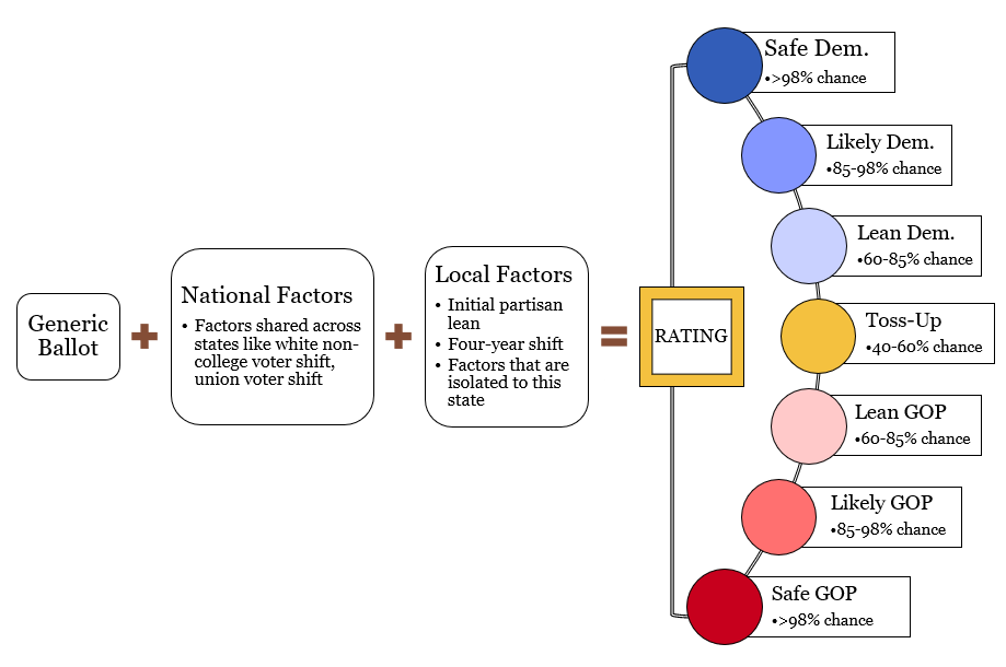
Here is the basic overview of what a given rating means. You’ll find that each state’s race is rated on a scale as follows:
- “Safe”: A state whose final electorate of one party over another is ten points (R+10 or D+10); this suggests the party has over a 99% likelihood of winning the state. This is an all-but-assured state for that party, but be mindful that if you were to run the election hundreds of times – and thus with hundreds of “Safe” states – you’d still expect fewer than one out of 100 to flip, which is a very low probability, but does happen. Nonetheless, “Safe” means we are confident in a party’s odds in a given safe state.
- “Likely”: If the final electorate of one party over another is between five and ten points (R+6 or D+9, for example), this suggests that the party has at least an 85% chance of winning the state, so the other party has at least an outside chance of winning the state in 1% to 15% of cases. It would not be totally crazy if none of them flip, though the more there are, the more you should expect at least one to flip.
- “Lean”: If the final electorate of one party over another is between two and five points (D+2 or R+3.5, for example); this suggests that the party is slightly favored but is by no means safe and the other party has somewhere between a 15% and 40% chance of winning the state too. If we have five or six of these on the final map, it should actually be surprising if at least one of these states does not go the other way.
- “Toss-Up”: A state whose final electorate of one party over another is less than two points (R+1 or D+0.3, for example) suggests that the race in this state does not clearly favor either party over the other.
We determine ratings at large based on polling data, demographic data, news events, historical trends, the electoral environment in similar states,Some states are highly correlated, like the midwestern states of Michigan, Pennsylvania, Wisconsin, Ohio, and Minnesota. If things take a dramatic turn in Wisconsin, you’d expect similar movements across those other states based on their similar demographics, political histories, urbanization, population size, economic similarities, etc. Note that proximity is not the best determinator for these variables; for instance, Washington state and Colorado are also similar; as are Maine and Montana. the difficulty of voting in each state, and all sorts of other smaller variables. We then dive into the local conditions, biographies, and narratives in each state’s race to fine-tune our analysis and build out a narrative to tell the “story” of a given race. It’s this approach, where we assess each race from the bottom up and make adjustments from that perspective (rather than the national, more generalistic approach of most outlets) that makes our work stand out and which, we believe, contributes to our record of consistently outperforming outlets like FiveThirtyEight and The Economist.
This is more scientific and rigorous than a mere “gut instinct” but provides qualitative considerations too. We feel, and our track record backs, that this is important; elections depend on more than what polls, fundraising totals, and demographics can capture – personalities, local issues, and national factors all have their own impact too. All of our ratings, estimations, and baseline assumptions – as well as any changes – are approved and signed off on by both the Editor-in-Chief and yours truly, the Politics Editor.
We’ve historically found that our approach benefits (and outperforms others) by being conservative in the middle and aggressive at the extremes. Historically, we used a step function based on a state’s final rating to allocate Electoral College votes; this protected us against big polling errors in 2020, for example, but made our model more grounded at the extremes. However, it led to problems when we were in a very tight election and could give a national forecast that was slightly unaligned with state level data. In that vein, we upgraded the model to use probability and smooth out this function via a normal distribution.
To get a normal distribution for every given point, we pulled the average polling error data for each Senate and presidential cycle from 2000 to 2022, which had a mean of 4.789 and a standard deviation of 0.743; by dividing the mean by the standard deviation we can reconcile those into a standard deviation which is inclusive of the average polling miss, about 6.45. From this standard deviation, we can run a normal distribution on top of any given rating, then just calculate the probability of all of the area below the “zero” point. For example, given a rating of R+2, we can drop a normal distribution with that standard deviation on top of it, and then use R+0 as the probability calculation point – calculating just the probability that there is an outcome resulting in a Democratic win (only the area under the curve below zero). For R+2, there is about a 38% chance that the Democrat will win.
Rolling Ratings
The first thing you may notice when you click through to our presidential ratings is that not all of the states are available. We switched to a “rolling ratings” approach last Senate cycle as we felt it let us pace out the state of the race over the course of the year a bit better. It makes even more sense for a presidential cycle, where it’s very easy for us to assess a state like Hawaii or Wyoming months in advance – well before we know who the party nominees are (more on that in a second) – but much more difficult to rate a famously close state like Nevada or Wisconsin until closer to Election Day.
We plan on rolling out presidential ratings throughout the spring and summer; eventually, our Senate ratings will begin to receive more emphasis and begin to be rolled out too. Generally speaking, more competitive races will come out later in the process because we need more information to adequately capture all of the relevant factors in a state. That’s not to say important information can’t be gleaned as we build out the map like a puzzle – there are plenty of interesting races that may be less competitive, but can help us draw a fuller picture of the race nationally.
All of our ratings are “forward-rated,” a reflection of what we believe will be the most accurate rating on Election Day given a certain generic ballot value. Essentially: if we know the national popular vote is around D+2, we can tell you if a given state is Safe, Likely, Lean, or a Toss-Up.
That means we won’t change ratings if we believe they are likely to change by Election Day or are not otherwise captured by shifts in the generic ballot, since that would defeat the purpose of forward-rating these races. But we will change as often as we need to if compelling evidence points to better or worse prospects for the candidates in a given state. We will also, of course, be prepared to adjust the ratings if circumstances and factors merit, subject to approval by both our Editor-in-Chief and Politics Editor. If it is a major change, we’ll publish a complementary article to boot.
If you’re unhappy with the fact you can’t see how a state’s rating appears on the map, simply because we haven’t rated it yet, click the “override” button and choose your own rating.
Factors, the Curve, and the Final Rating
The next thing that may stand out to you when you look at our ratings is how we’re telling the story of each race. The first thing you’ll notice is probably our map, showing a given rating for each state or district. This is not just one election, it’s 56 different elections – all 50 states, the District of Columbia, and the five congressional districts in Maine and Nebraska – and each of them is either a little (or a lot) different. We’ve taken care of the hard part and aggregated each election so you can see national results, but let’s talk about how we get there.
It helps to start at the bottom. By clicking on a given state or district, you’ll receive some key information as to how we’ve reached our conclusion for a given state; this includes the national factors as they apply to the given state and any independent local factors. Local factors are those which only affect the given state or district. Particular Native American groups, Cubans in Florida, down-ballot elections which may boost turnout, home state advantage, and the relative strength of a state party all jump to mind as examples.
Every individual state or district has to originate with a baseline, a starting point for a given race that we then apply the other local and national factors on top of to reach a conclusion. The baseline begins with the state or district’s partisan lean, straight from FiveThirtyEight – an estimation of how many points to the left or right of the nation a given state is. For example, if you assume the national popular vote is split 50% to 50%, and a state has a partisan lean of D+2, that state would be expected to go to the Democrat by 2% (51% to 49%, for example, though we note considering third parties this would also suggest a 48% to 46% to 6% result).If you’re mathematically inclined, or are just curious without wanting to dig through our code, essentially the whole calculation functions based on positive values denoting “more Republican” and negative values denoting “more Democratic.” For example, the function treats -2.5 as D+2.5.
After reporting the baseline, things get more interesting. Here’s how you can think about this as we build up from the state level: if the state’s partisan lean is R+7, but we have it as R+2, what factors are layered on top of it to shift it five points more Democratic than where it was in 2020? This is where the curve comes in: it incorporates data to visualize the story of a state as the factors bend a state’s environment one way or another before reaching a comprehensive conclusion.
The first obvious factor is the generic ballot, which tells you who is leading the polling average. If you think the Democrat might win the popular vote by 4.5%, like in 2020, then the generic ballot is how you would apply that assumption across the map. The current generic ballot (essentially, the way the national environment is leaning independent of any given candidate) helps us adjust the baseline to as close a guess as is reasonably possible for what the popular vote margin will be. It’s a pretty good proxy for the way the electorate at large feels nationally, considering things like the perception of the economy, which candidate is more popular, whose policies are favored, etc.
In our hypothetical state with an initial partisan lean of R+7, where the generic ballot is D+4.5, then the state is now leaning R+2.5. But, let’s say we believe that the state leans Democratic even with this first generic ballot assumption, in part, because a lot of polls are showing Democrats in the lead in that state specifically. Polls are useful, but not explanative. They can, on average, help show where a state may be – but we feel strongly that there must be underlying reasons to back up that assumption, and that is where the strength in how we’ve handled our ratings for years comes from. So, now the factors will help explain and justify getting us to a place where we move the state another five points from its 2020 baseline, so it’s around D+2.5, in Lean Democratic territory. This helps keep consistency as the national environment effects a shift across all states, while accounting for the factors that explain differences in polling, or that we believe are not being captured.
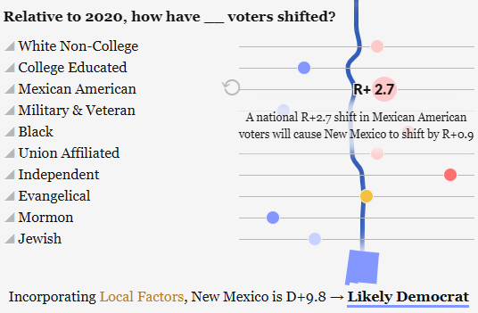
Now that that basic concept is clear, let’s get into some more specifics about these factors. After the map, the next thing you may notice are some demographics and considerations that we believe independently affect, or could affect, the outcome in the race. We call these, when applied to a given state, “factors.” National factors are interoperative, in that when they shift, they affect most states to some degree (weighted by the particular percent of the state which that demographic or factor represents); think of key voter blocs like Mexican American voters or college educated voters. Local factors affect only the state or district in question, but can help add some context to differentiate states that are otherwise similar; think of things like ballot measures or competitive Senate elections which may boost a given party’s turnout, ease of voting, or a more localized demographic (like Cuban Americans in Florida).
You can also click on a factor’s title for more information on things like that population’s percentage in a state, sources on which we based our analysis, and more.
The combination of a state’s initial lean, plus national factors (including the generic ballot), plus local factors, will draw a path towards the final rating.
National Factors
The national factors are based on macro considerations or demographic groups we feel will have a national impact on the race (across more than a couple states) and whose shift will impact every state or district to some degree. By default, on the map, we have provided our own forecast for where we believe these voters have shifted relative to 2020 – but you are welcome to disagree with us and change it up, as I’ll explain shortly! Before you do so, it may help to know what a change will do.
With a few exceptions I’m about to describe, a shift in the factor will shift the forecast partisan lean of a state by the percentage of that state that is that population multiplied by the shift. For example, a D+1 shift in the political inclination of the Mormons in a state would shift a state which is 60% Mormon by D+0.6 points (hover over the factor slider to see how a given shift from 2020 will affect the selected state in 2024). You can click into a given state to get a little more information on the makeup of its population, how a given rating affects a state, and more.
Our national factors are as follows:
- White Non-College Educated: the percentage of a state which is white and does not have a bachelor’s degree; this is our largest population-based bloc of voters. We believe these voters are still shifting towards Republicans, but with diminishing marginal returns for the party.
- College-Educated: the percentage of a state with at least a bachelor’s degree, an especially important and high-turnout part of the electorate. Given the high turnout rate and the critical shift towards Democrats, we expect a boost for Democrats with this group.
- Evangelicals: the percentage of a state that is evangelical, these voters are particularly pervasive in the South. They are already staunchly Republican so there are diminishing marginal returns for the GOP with these voters.
- Political Independents: the percent of a state that does not lean towards either party. States in the West and with an “independent spirit” (like Texas and New Hampshire) tend to have more of these. Given heightened third party activity this cycle, we expect that these voters will slightly, but disproportionately harm the incumbent party.
- Black Americans: the percentage of a state that is Black, a particularly powerful demographic in the South. There are some signs that these overwhelmingly Democratic-leaning voters may shift slightly towards Republicans this cycle.
- Mexican Americans: the percentage of a state that is Mexican American, a key demographic in the Southwest. We anticipate that these voters will shift slightly towards Republicans this cycle given heightened frustration with immigration and the economy.
- Union-Associated Population: this is the percentage of a state’s workforce that is associated with a union. We are treating the workforce percentage as the population percentage at large because we feel this will better capture households who are associated with a union, rather than individuals. We anticipate only a minute shift towards Republicans from this group given the party’s increased efforts at courting them in recent years.
- Veterans & Active Duty Military: this is the percentage of a state that is a veteran or active duty military. High levels of transience cause volatility in active duty military populations, but veterans make up most of this demographic regardless. We expect these voters will continue to shift towards Democrats given the party’s high emphasis on institutionalism.
- Jewish Americans: the percentage of a state that is Jewish, which is small in most states, but potentially important in close states with a higher share of Jewish Americans, like Pennsylvania and Nevada. Though this group is already heavily Democratic, we expect these voters to shift slightly away from the party this cycle.
- Mormon Americans: the percentage of a state that is Mormon. Though not particularly widespread, they are an important enough part of the electorate in many Mountain West states (and in potential swing states like Arizona and Nevada), and we expect them to continue shifting towards Democrats this election given the Republican Party’s recent turn away from the group’s priorities.
Local Factors
Next, let’s talk about our local factors.
We highlighted the adjusted partisan lean which serves as the starting point for any state or district above, and you’ll of course find that information first on a state or district’s local factors.
After that, the first local factor you will see is the shift. We have found success in our own writing, coverage, and thinking about elections by building on the “trendline” of a given state’s partisan lean. By assessing every state and district’s margin in presidential elections (beginning in 2000 and running through 2020), adjusting for the national margin in each race, we can see how that state or district has shifted (on average) every year and we can find the strength of the correlation between time and this shift. This lets us do two things: first, if we take the partisan lean data and add the average yearly shift (multiplied by four), we can predict a state or district’s partisan lean in 2024 better than we can with partisan lean alone. Second, we can account for places whose shift has been less stable by multiplying this shift by the R² value of that state’s data. For example: the 2024 partisan lean for a state like Texas, which has become 0.62% more Democratic leaning every year, and where it is strongly correlated with an R² value of 0.82, is much more predictable than a state like South Carolina, which has become 0.01% more Republican leaning every year but where the R-squared value is practically zero (meaning there is no correlation).
By taking the adjusted partisan lean plus four times the yearly shift multiplied by the R-squared value, we get as close a guess as possible to a state’s baseline partisan lean for 2024. It is now up to us to explain why a state’s rating should be different – or not. Any change from this point forward is either a result of the national factors impacting every state, or local factors we feel justify where a state ends up for our rating this cycle.
In closer or more complicated races, you’ll find more local factors which will have an impact on the race. But for many states, this is all relatively easy. Not to continue harping on Hawaii and Wyoming in this explainer, but they’re both good examples of “Safe” states (based on our baseline factors) with no or few countervailing factors at the local level. Not necessarily because they will definitely be R+30 or D+40, or whatever, but because there are no reasonable factors which can really justify getting the race to a place where it’s competitive. That said, we’ve aimed for inclusiveness of factors just so you can play around, which brings us to…
Interactivity
Up to this point, we’ve not done anything meaningfully different in terms of how we “think” about a race. Sure, we’ve applied some data and better visualization to get our point across much better (and in a much more engaging way) than we have before, but the concept is essentially the same: we’re telling the story of the national race based on the storytelling from the bottom-up.
But what if we’re wrong? We’re pretty good at this, and we’ve been doing this for a while, so when we tell you we’ve put a lot of time and thought and energy into making our ratings, we hope you treat them as a useful starting point. But, you are also totally welcome to disagree with us and change things on your end because almost every part of the model is adjustable!
Whether you think we overestimated how Democratic Mormon voters have become, or your high ranking uncle has told you about a major national security secret which would result in Virginia shifting dramatically to the right, or if you just have a gut feeling that Black voters may favor Trump far more than they did in 2020, you can adjust the model accordingly. Any change to the national factors will similarly affect other states (proportionate to that population in each state) and any change in local factors will be localized.
Don’t Miss a Thing: Get Our Content in Your Inbox!
You can also override how factors are impacting a state entirely by clicking the “override” button and picking a defined rating. Or you can clear the map, or reset to the defaults, by clicking their respective buttons too.
So feel free to play around, grab a screenshot, share your map to social media, or use our tool to advise the Harris or Trump campaigns on which voters matter most in the state you’re worried about! Feel free to @ThePostrider when you do, or let us know if you have any questions or thoughts!
The Forecast
We’ll conclude with this: our projection of the final electoral count is not, strictly speaking, a prediction, it is a mathematical allocation based on the candidates’ respective odds across the states and the states’ electoral votes. We award electoral votes proportionate to the odds (0.65 multiplied by the state’s electoral votes if it’s a 65% chance, or 0.99 multiplied by the state’s electoral votes if it’s a 99% chance, for example). Once all states’ presidential races have been split in this way, we round to the nearest full electoral vote.
Our national odds and rating (i.e., what you see for the United States’ rating) layers in one final level of probability. We first take the estimated electoral votes given the current generic ballot rating. Second, we find what the generic ballot would need to be for the Republican electoral votes to be 268 (we use 268 instead of 269 because, frankly, Trump is heavily favored to win a contingent election in the House of Representatives, should a tie occur). Then we run a normal distribution given the current generic ballot, the “tipping point” generic ballot, and the standard deviation for national generic ballot errors using data from the 21st century (about 2.64). The cumulative probability here tells us the percent chance that Democrats have of winning the presidency, and we apply a rating using the same breakpoints as mentioned earlier (60%-85% is a lean, 85%-98% is likely, etc.).
To reiterate very clearly: an individual state’s rating and probability are based on the odds a state has of being won by a given party; the United States’ rating and probability are based on the odds that a given party will win the Electoral College.
Remember that we’re not making predictions, we’re just providing an educated assessment on the state of the race in every state. So don’t write us a mean note after Election Day saying “you had it as 84% chance of Democratic victory in a state that the Republican then won by 0.2%, you blockheads!” No, we didn’t predict that that state would go for for the Democrat, we’re merely stating it’s much more likely than not to go for them, but that the Republican still absolutely has a shot there. About a 16% chance, per the above. In fact, if that’s not happening in about 16% of races with an 84% probability rating, we’ve actually done a bad job — we should have considered those races safer for that party. That being said, our overall projection on the final seat totals has consistently outperformed or matched The Economist and FiveThirtyEight, so our averages seem to do all right!
With all of this in mind, The Postrider is proud to present our own ratings and analysis of the 2024 presidential election. We hope you find us a welcome part of your 2024 election deluge and enjoy tinkering with our tool as well!