
How Our 2024 Presidential Model Works—And How You Can Use It Too
“Dread it, run from it, destiny arrives all the same, and now it’s here.” The 2024 presidential election is
Well… maybe not just like we did. For 2024, we really shelled out. Beyond our traditional ratings and analysis, we’ve added a ton of features that allow you to visualize what factored into our conclusions, how the entire presidential map fits together, and even make your own assumptions.
Yes, that’s right, our map is now totally interactive – you’re welcome to tweak our analysis and assumptions and see how it affects the presidential race, share the map with your friends, explore the data, and visualize how states have shifted over time. If you can’t contain yourself, head over to the map and check it out. Otherwise, read our full methodology about our own conclusions, or continue reading for a quick primer on how to use the tool like a pro.
The Basic Concepts: Partisan Lean and Factors
There is really just one concept to grasp to effectively play with our tool: partisan lean. Partisan lean is how many points more Republican or Democratic a state or district is compared to the nation as a whole. For example, if you assume the national popular vote is split 50% to 50%, and a state has a partisan lean of D+2, then you would expect the vote in that state to be 51% to 49%, as Democrats have a two point advantage.
The partisan lean provides the baseline, based on some historical data (predominantly the 2020 presidential election), and you may then apply assumptions about given factors on top of them, to see how a particular state might shift. The first obvious factor is the generic ballot, which tells you who is leading the polling average. If you think the Democrat might win the popular vote by 4.5%, like in 2020, then the generic ballot is how you would apply that assumption across the map.
But we’ve given you a lot more to work with. By clicking on a given state’s local factors, you can see the partisan lean, which provides the baseline for that state, and survey the qualitative and quantitative factors layered on top of this baseline which build towards the ultimate rating. These are broken into national factors (which affect every state) and local factors (which affect only the selected state or district). We’ve made some well-researched assumptions, but the map is designed for you to actively rebut our assumptions and see how it plays out. Some factors are weighted by impact (like a home state advantage) or by the percent of the population (for example, if you believe Mexican American voters have shifted about three points more Republican than they were in 2020, you’ll see that only moves the state substantially less – only about a third as much in the pictured example, because Mexican Americans make up only 32% of that state). You can hover over a factor slider to see the shift and the actual effect. You can also click on the factor title to get some more data and learn a bit more about why we made a given assumption.
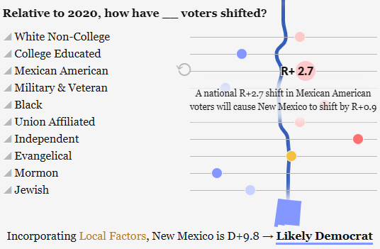
We’re big proponents of building towards a political conclusion by telling a story, and that’s what that curve sandwiched between the various factors is doing: it’s drawing a path from the initial partisan lean towards the final rating for a state, where it is bent and redirected by assumptions about the given national and local along the way. It is reflective of the state’s lean at every single point, given the assumptions, and will always end with a comprehensive conclusion of the state’s rating incorporating all national and local assumptions.
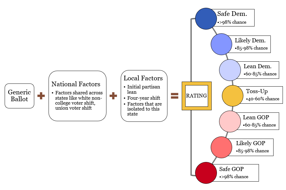
You’ll find that the final rating for each state or district is rated on a scale as follows according to the odds of a party’s victory in that state:
- “Safe”: the party has greater than a 98% chance of winning that state.
- “Likely”: the party has greater than an 85% chance of winning the state.
- “Lean”: the party has greater than a 60% chance of winning the state. If you have a bunch of these, don’t be surprised if one of these goes the other way!
- “Toss-Up”: no party is clearly favored as no party has more than a 60% chance of winning the state.
So feel free to play around, grab a screenshot, share your map to social media, or use our tool to advise the Harris or Trump campaigns on which voters matter most in the state you’re worried about! Feel free to @ThePostrider when you do, or let us know if you have any questions or thoughts!
Some Understandable Questions
Many of these are answered in great depth in our extended methodology, but a few of these are useful to know if you just want to dive right in:
Why are some races “grayed out”?
If you click on a grayed out state, a blurb will explain that we’ve not published a rating for the state because we believe there is not yet enough data to responsibly or adequately assess the race in that state. Generally speaking (but with some exceptions), these are closer states. We’ve published our map fairly early in the presidential election cycle, so there are still plenty of yet unascertained factors that could come to matter in a lot of these states. That said, click on one of these and then the “Override” button to apply the national factor assumptions or override a rating entirely… at your own risk!
Why do Nebraska and Maine have special buttons?
These states award electoral votes based on statewide vote and vote in each congressional district. So there are technically several separate elections in each of these states. The statewide election is reflected by the ones on the map, whereas the buttons indicate the individual districts.
What are the electoral vote totals?
This is the projection of the final electoral count based on the given assumptions; it is a mathematical allocation based on the candidates’ respective odds across the states and the states’ electoral votes. For example, if a state with ten electoral votes gives Harris 87% odds of winning, Harris will receive about nine electoral votes there (87% multiplied by ten) and Trump will receive about one, the remainder. Our model relies on a function that is conservative when odds are close and more aggressive when odds are clearly in favor of another party. This helps prohibit topline error if one state is further left or right than it should be, and provides a moderating effect that historically has been far more accurate than models like FiveThirtyEight’s or The Economist’s.
And what’s the national rating?
This takes all of the state ratings, then runs another probability equation on top to account for generic ballot error by looking back at what generic ballot value would affect the “tipping point.” From this we can determine the national odds and rating (the chance a party has of winning the Electoral College). You can read more here.
Why do some states have few or no local factors?
For one, the national factors are pretty inclusive. Most states, especially states that start out favoring one party or another more substantially, will not see dramatic movement outside of the national factors, or that captured by the generic ballot. Second, we do at least attempt to make reasonable assumptions – with a few tongue-in-cheek references here and there (see Florida…) – so we are careful to provide local factors which are inclusive as to what might affect the election without making a totally unreasonable assumption.
I still have unanswered questions!
No worries, this piece is intended to be a brief introduction that lets you get started using our model, but our comprehensive methodology goes much, much more in depth. Alternatively, feel free to shoot us a note, we’d love your feedback and thoughts!